miércoles, 28 de septiembre de 2016

Ref 1085/1086.-   Crystallizing watercolor with Epsom salts

One of the funnest parts of watercoloring is creating textures!  I really really love to just play around with these.  There are so many possibilities.  Adding texture really adds interest and personality to a painting
Epsom salt "paint" creates an almost magical painting experience -- the liquid dries into crystals that look like snow or frost. The wow-worthy process happens when water evaporates out of the Epsom salt -- magnesium sulfate -- solution, leaving behind nothing but magnesium sulfate crystals

I did some previous experimentation to check in the best sal to wáter ratio, and I had good results with 1/2 tsp to 4 tsp of wáter to see sparkly crystals within the watercolor paint given a shimmery gloss effect .- to that proportion also add along a pinch of salt - (Add liquid watercolor for your desired hue and paint with that as normal you do,. the effect is produced before 24 hrs

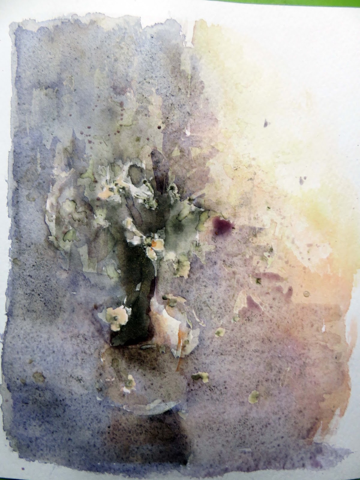
This is the result of this process: (after 24 hrs)


Material needed;
Epsom Salts; (Magnesium sulfate) less tan 20 gr
Watercolor pencil  red, orange, Brown
Watercolor tubes; crimson, burnt sienna; médium yellow, magenta, cerulean blue, violet
Round brushes
watercolor paper, cold press 220 gr
tape
2 unycel containers one with plain wáter, another with the Epson salt solution

1st Step.- I use to work loose so I feel confortable with some freehand guide lines which I do basically with watercolor pencils
Note paper has been streched previously


2nd Step.- In a plastic  try I put the colors I need, and before take the paint I dip my brush in the solution to paint with it, (this part of the process is wet on wet) and tilt my paper to spread the color as I need


3rd Step.- I lift up some paint to crate forms and let it dry partially to continue mixing colors


4th Step.-  Ongoing work to form shadows


5th Step.- More color


And more color (when color is wet is deep and darker)


As it dry color become less deep and is the time to reinforce colors and add definition, and here is the paint once is completed .- the effect of crystals start to appear


This is the paint after 24 hrs, the water evaporates from the solution, the epsom salts will be left behind, and will organize themselves into crystals. Small crystals will form rapidly where the epsom salt solution is thin and water evaporates from it fast. In the deeper puddles, the water takes longer to evaporate and longer, spiky crystals have more time to form
when angle the paper correctly you can catch the shimmering gloss crystals, which gives brigths into this watercolor

                            "The woman in the red hat, on a hot day"


Notes;
To make coloured crystals:
Mix watercolour paints with the epsom salt solution then layer onto thick white paper  -- Overlapping colours will make nice effects.
It will take some time to dry, but is worth the wait to see the sparkly crystals,

Bomus painting
I did a second paint with a different ratio with 1/2 tsp Epsom salt to 1 tsp of wáter  plus a pinch of normal salt .----  the crystals are better and a Little bit bigger (I did a ghost to check on White color over black colored paper .- the White used was gouache and didn´t work as good as in the watercolor paints 


Close up photo of the shimmery crystals which add additional and misterious brigth to the painting


viernes, 23 de septiembre de 2016

Ref 1084; Watercolor.- Scratching & Scraping in a watercolor surface

Looking for the ways to make part of the painting interesting to develop unique lines, shapes, marks and textures,  I did this easy exercise from where I like to share some interesting tips and/or experiences.

This is the result of this practice


Materials needed;
Cold press paper 240 gr
Plastic card ( cut in different ways to manipulate the paper surface)
Drywall sandpaper grit 100
watercolor set (colors referred within the steps)
permanent White (gouache)
round brushes / fan brush
absorbent paper

Step 1.- PRACTICE.- I cut old credit cards with a variety of different edges .- the brush apply the color but this new tool will provide lines, digs, scratches,-- surfaces marks vary greatly with the amount of pressure applied, surface complexity can be developed by laying a colored wash over a dry scratched surface and scratching or scrumbling into it.
Over scratch paper I previusly did some tests in the top background color is ligther tan in the bottom, after wait for dry the first lay I applied same color to check in results to scratch with the plastic tool

 
Also I tested what if;   I use watercolor pencil , wet and scratch
 
 
Best contrast was obtained with a background with a first layer darker,
1st Step.- in order  to make a better contrast of the scrapped gold meadow I´ll paint a thundercloud in the horizon for practical purposes so in a wet paper I´ll drop in the center a mix of ultramarine blue / yellow ochre / payne´s grey and tilt the paper from the center towards the edges, in the horizon the color should be darker so into the same mix I added red crimson in addition
to add some clouds just lift some color with an absorbent paper here and there
As underpainting for the meadow same initial mix plus violet lifting color with an absorbent paper (to avoid original White color paper) and some shadows (payne´s grey) quite diluted added with brush


2nd Step.- I chose médium yellow and hooker´s Green for some foreground spots. which I scrapped to conform several lines in a selected windy direction, if you want to add figures and/or any additional element is better to work with masking fluid I didn´t because I plan to work with darker colors in a figure by the end, however instead  I try to avoid addition of  color at that part
The scraped lines are short but with same color everything looks similar in the painting at this moment 
 
 
3rd Step.- In a loosy way the figures are added with violet (fine round brush) opposite color in the colorwheel for yellow to conform the shadow base, sky color reinforced again in the horizon and lines scraped in wet condition to have a mix at the distance and make suggestive texture
 
 
4th Step.- With the plastic card tool, in 90° direction apply ligther yellow´s colors mixes to form suggesting áreas through the painting distances  and start to give 3D perspective with warmest colors at the foreground and coolest color (darkers at the meadows background) this will break in different hues and in a better color perspective
And also you´ll see ligther colors in the scratches making more random colors (this is wet on dry)
 
 
5th Step.- I added more watercolor figure definition and hooker´s Green shadows at the foreground scratching every time I apply that color 
 
 
6th Step.- As there is some windy condition I need to créate that atmosphere by grinding (very gently) the sky paper surface with drywall sandpaper in same direction as the meadow suggest
 
 
7th Step.- Now the ligth reflections, with a fine brush make more lines (more at the foreground) and scratch again accordingly (probably will be better if you rub soap bar,  over the meadow to break even more the White lines added .--- I didn´t do it but probably will enhance the texture)
 
 
8th Step.- I reinforced  a Little bit with more color where I need it and add permanent White in the sky suggesting the sun fading with an absorbent paper through the different edges
 
 
9th Step.-  ( Optional Step ) with wáter spray and absorbent paper I lifted color because the deep lines will show up more easily at the bottom and because the sky become dirtier after my first grinder operation leaving darker spots into the paper grain,  after do that I grinding again leaving a ethereal lighter color suggestion more uniform
Like I said I repeat this part of the process because I didn´t take care first time so It is better to practice in a scratch paper evrything you need
 
                                
                          "Who looks outside dreams, looks outside awakes"


lunes, 19 de septiembre de 2016

Ref. 1083 Watercolor / Selective Focus with modeling paste and underpainting techniques

Transparent watercolor can be used in glazes or layers to create a wide range of colors!  You can create under painting texture, color combinations and /or prepare a careful under painting likeness
For the following Project; I did a combination of techniques in which I didn´t follow a particular rule, the idea is to créate texture in a different way, I love to discover new methods, thus I discover new opportunities and I have fun


This is the result of the following exercise;


Materials needed;
watercolor cold press paper 240 gr
charcoal bar
iridiscent gold médium
Modeling paste
artistic varnish
round brushes
Watercolor set * colors indicated into the steps;
permanent White (gouache) 

Preparation Step , I prepare fine powder by scraping a charcoal bar and add into a pool of watercolored wáter,
I prepare 3 different colored pool containers.-  ultramarine, carmín & médium yellow, more powder was added in te first one plus iridiscent gold médium you can see results  in the scratch paper before and after adittion testing


1st Step Rather than painting the entire area, leave some white, dry spots; these can be left white or painted a different color later, so base in my previous ligth pencil guide sketch I fluid masked accordingly with and old fine brush and let it dry  I divide the painting área in 4 background tone imaginarium scheme, painting first left darker area


2nd Step.- Now gradually integrating the following two pools  on the rigth side first the carmín and finally the yellow - upper rigth side is just white color paper (you can see the powder dust within the paint
Next spray the área ligthly with your pump wáter sprayer, this will help set the texture,  now rinse up the entire paper again with your sprayer to lift up with absorbent paper, you can assess the pattern repeating the technique for more texture, the ides is to avoid 2D same and/or similar color scheme
(where there is masking fluid you can see how dark color is agglutinating giving us the deep sense


3rd Step.- Repeating rinses process (if needed) and let it dry completely - at this stage you can take away part of the masking fluid to give additional hues through out the painting process

 
Note the iridiscent médium is usually mixed with the watercolor to increases gloss, appearing more luminous than color washes alone


4th Step.- Remanent masking fluid is taken away rubing gentley with your fingers
Complementary colors are chose for a gradual shadowing for yellow--> violet, for blue---> orange plus payne,s grey for the base trying to get more contrast color impact between light and dark as I´m suggesting different flowers location,
"I´m suggesting flowers location because the main idea of this painting is try to represent out of focus foliage as my first main stage so you don´t need to work details yet", however I start to detail some by the center (designed  focus área of interest) to in some way start to get integration with following steps

 
5th Step.- Before this paper be completely dry, spray wáter again in order to fade some color boundaries  and for additional lifting of colors to integrate a gradual light source from upper right, that will complete our out of focus scene underpainting first stage, which once you be satisfied with the result --- let it dry completely -  


6th. Step.- In order to créate the focus área adding texture for an additional 3D effect I took advantage of modeling paste and again with same flowers color I mixed them to start adding in a selective área with the help of a small spatula.- Here again I suggested flowers form but this is the moment to try to define them better


So far this is the result which you need to wait for dry


7th. Step .- By previous exercises I did use artistic varnish with good results over modeling paste, this time trying to be creative I mixed the aristic varnish with a dab of yellow ink and I cover with a big round brush all paper área, over the modeling paste spots  it Works better however over the paper it works like a new color glazing

 
8th Step.- Watercolor paint still Works fine over all this previous layers, so in order to integrate and complete this exercise I fill with additional ligthest color some áreas to créate and integrate the final atmosphere  and apply pure white at the base for final reflections lifting color in all edges with and absorbent paper to integrate those pure colors
 
Pros.- The result with the iridiscent médium on the dark side, gives some additional reflections depending on the natural light source when you looking at this painting and the 3D effect  with selective focus is achieved,


And more details


jueves, 15 de septiembre de 2016

Ref 1082.- Watercolor / Watercolor & modeling paste a different approach

Sometimes is necessary to créate enough texture to hold the paint in place but also for fine brushwork and detail, (watercolor cold press paper is optimum for that,) but I´m working with a different paper so I need to enhance the surface to work with .- this exercise is about that

Here is the result of this particular technique

Material needed;
Paper Stardream colored paper 105 Lb (there are many colors to work with) I chose silver color
Modeling paste
Spatulas several sizes
watercolor pencil
watercolor set; cerulean blue, raw umber; payne´s grey; cad orange & red ; aureolín,
 Permanent White in gouache
round and flat brushes

1st Step.- With watercolor pencil (Brown and yellow) .- sketch but also fill the inner spaces of this bird


2nd Step.- Just before apply modeling paste with a small spatula in accordance all contour, wet your fingers and pass above the figure to reactivate the watercolor pencil which will mix in some way with modeling paste layer .- this layer will be of the mínimum thickness you can add above the outline figure


3rd Step.- You need to work fast and/or by áreas to conform a texturization accordingly with the help of and old flat brush to styling the small feathers of the figure orientation

 
4th Step,.- Wait for modeling paste to dry (it does not take so much time) and then you have the underpainting phase to work with
Now you can start watercoloring.- I start by darkering colors to mixing them until you achieve the required strength, wash the brush, then pick up one color and add following the color flow.- you´ll see that paint over modeling paste is quite easy and give many different hues regarding wáter application you can lift up paint with a sponge to integrate tones


5th Step.- I complete with brigthest colors .- some pigments are more opaque tan others and it is important to remember when overlaying colors and or save White spots as much as posible since the begining


6th Step The permanent White color (gouache) is now applied to highlight all the figure, and final details reviewed and improved


miércoles, 14 de septiembre de 2016

Ref 1081.- Watercolor mixing color on masking fluid

This is another experiment adding a dap of color to diluted masking fluid around the luminous White spot in order to kept a blur color condition around the lightest source spot (in cold press paper)

This is the result of this process:

                                The firefly

The tone of the paint is deeper when wet, you can see the masking fluid application which needs to be in dryer paper and how is colored around


When it dry take away the masking fluid but left a Little bit around the White spot so when ypu paint again the dissolve condition can be difuminated a Little bit better


martes, 13 de septiembre de 2016


Ref 1080 Acrylic .- Texturizing the canvas on cardboard

 
"The color of a rainy day"
acrylic over texturized canvas


This is the result of this technic;


Main Graphic steps;
Masking frame
modeling paste colored with paint and applied with spatula


Start by covering average médium value color (after planing previously your work)


We need a smooth surface to work with is easier than a rough one
so spray wáter before everything become dry and tilt the cardboard  accordingly

 
After competely dry apply color ligth again mixing the pale tones with modeling paste and apply with spatula


Before completely dry make the surface smoth with spatula and/or make more texture where you need like the branches


Now you have the underpainting to work with just brush to redefine lines and details (save whites spots every time you can


Final details and tape frame away


Varnish application and additional wáter drops above varnish once is dry