viernes, 1 de septiembre de 2017

Ref 1207/1206/1205.- Ink over watercolor wash and over Stardream aquamarine color paper

When drawn with knowledge, a great ink drawing carries a certain evocative power that stems from the cleanliness of the finished work. However, that same cleanliness can also leave you vulnerable because high contrast line drawings give you nowhere to hide. Every line communicates knowledge and power or timidity and uncertainty. It’s a fine line between one and the other

This is the result of the following Project;

                  Ref 1207 "Sunsets are the proof that endings can often be,
                                     beautifully too"


Main steps;
After some previous testing, I decided to start with watercolor to complement this time with ink
Then I start with watercolor wash to suggest a sunset over this particular aquamarine color paper 105 lbs

Progresing adding more shadowing towards the bottom


2nd Step I diluted ink until be confident to sketch main branches into the foreground, and here comes and start  the meticulous work

It is important to consider hatching and line weight, here’s a trick that takes tones more literally: try rubbing a bit of water onto your fresh ink lines to create softer tones.


I did use brush for the biggest branchs but then I start to use ink in different shades of grey and thickness
I use different pens for different things. I use thick markers for large shadows because they’re big and chunky and cover a lot of paper quickly. I like Sharpies for smaller shadows and thick continuous lines. A blue writing pen might be good for clouds, waves, or anything that might look cool in blue. Consider all characteristics of your pens, like colour, thickness, etc. Be creative and stay alert for any pen that can make your work distinct
Value is controlled by your ink to water ratio – the more ink or less water, the greater your value. Start with your brush dipped liberally in ink so it collects on your paper. Paint by pulling the “ink puddle” across the page. Re-dip your brush when needed, always keeping a puddle, and continue washing. Ink wash and watercolour techniques are similar

 
Step 3,.- To integrate the different grey tones, I did use first wáter to moisture absorbent paper and in some way apply to uniform the color accordingly (far and near) Then I did use plastic lacquer in  Spray "True Film"which fullfil 2 purposes uniform more deeply the color and créate an upper film layer where the additional watercolor added créate a sort of breaked texture as for grass and leaves, also I spattering some dark watercolor to suggest more leaves into the foreground here and there (do not overdue)
 

Final touchs .- Once you’re finished inking, do a wash to add dimension to your drawing.- White and yellow gouche added into the sun and around that ligth source;  touching some branches to suggest a more calid sunset and this was the result


Ref 1206 In the following example most of the job is with pencil and ink before the watercolor wash, you need to have care to avoid disturb the ink when watercolor is applied


The unforgiving permanence of ink can stress some people out. But remember, just because you’re making an ink drawing doesn’t mean you have to use ink all the way through. I’m a firm believer that art should be fun and stress-free. So if launching straight into ink is too much pressure, try drawing your image in pencil first, then add ink over it. Either way works, just do what you’re comfortable with to set yourself up for the greatest joy.


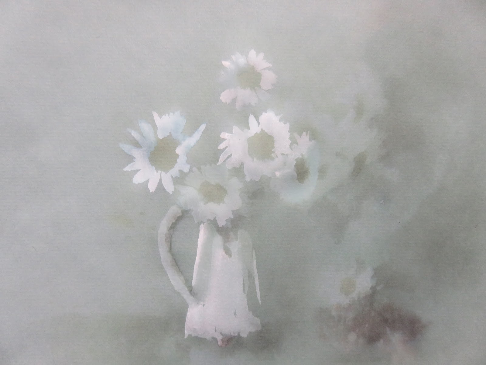
Ref 2005.- In this example I use watercolor first and ink and White & yellow gouache to highligth
The ink sometimes is covered and the result wasn´t as I expected, but were my previous exercises to recognize what Works better  under different conditions

Hold on loosely!
Simply changing the way you hold your pen can add an extra dimension to your drawings and make them special and unique so that they stand out from other artists. I like to hold my pen at the back whenever possible because the looseness in my lines often present unexpected opportunities in my work. If your drawings are usually very tight and controlled, give this method a try, you might surprise yourself with the wonderful accidents that can happen in this Project I didn´t want to make an architectural sketch I try to make it artistic in some way


Don’t be too quick to throw away your dried up pens! Pens on their last breath can deliver a very dry, almost brush-like stroke, which has a completely different look from other tools. Also, by putting dry pens away with the cap tightly fixed, you may resurrect them for a few more minutes’ use. Try it the next time your pen diez


Art should be fun. You can forget this when you worry too much about making mistakes or obsess over every line you draw and forget the joy of making art. Remember the bigger picture. Every journey every making is fraught with mistakes and missteps. That’s okay; it’s normal. Just remember that each line serves a greater whole and leads to your final image. If you make a mistake, chill out and move on – it might not even be noticeable in the end. Your lines WILL get better with time so enjoy the journey


domingo, 27 de agosto de 2017

Ref 1203 Watercolor & gouache/ Modeling Paste & phosphorescent markers over Stardream paper


(Just the vase and some branches have phosphorescent markers color; previously to the addition of modeling paste and then watercolor over those áreas)


                       "Ideas are one thing and what happens is another"

miércoles, 23 de agosto de 2017

Ref 1202/ref 1201; Watercolor - Now over colored Strathmore 500 paper
                This paper it has a smoother side (side in which I worked with) and other with obtrusive testure, made basically for pastel work, This paper is not intended for watercolor but gives good results with some care, -- paper type is only one thing to think about. --You also needs to consider the color of the paper for a better impact on the results of the watercolor intent

This is the result to work with this particular  paper, just consider the ability of the surface to get wet  < see main steps below>


The chance to try different materials and see the results is one of the highlights for me.  It is through this experimentation that you discover what works and what doesn't., so I hope you like this particular Project.
Paper color employed is Fog blue; 64 lbs Strathmore 500 series 100% cotton


1st Step sketching preparation.- "Optional" In order to reinforce the background texture I did use powdered artist´s charcoal which will be added in a pool of wáter, in order to sketch some background reference lines onto the dry watercolor paper with the help of a round brush , however also can be use just a pencil for main reference lines


Sketching result;
2nd "A" Step .- Working from ligth to dark .- White application base on ligth source


2nd "B" Step progress.- Note this paper does not withstand much humidity, so work with care and let it dry periodically

3rd "A" Step.- Continue watercoloring and shadowing accordingly

 
3rd "B" step from time to time I´m spattering with paint in a toothbrush to conform an atmosphere and suggest an área of interest through out the shadows

4th "A" Step I decided to add a figure  into that shadow, so I start to define it with fine brushes as the rst of this painting


4th "B" Progress

5th Step .- Final touches and more definition

"The Mirror ,.- Whatever you want, to give. Be the best reflection of yourself"


Ref 1201 Anther example without use of powdered graphite pool
This was made over "Golden Brown" color same paper

lunes, 31 de julio de 2017

Ref 1199.- Watercolor over texturized paper with the help of modeling paste

Horror is the removal of known masks


Main Graphical Steps:

Pencil and loose brush for sketching main lines

 
Modeling paste, blending with watercolor, applied with brush and conformed with a rough sponge


Modeling paste applied with spatula into the mask área, as you can see the mask features are still visible due the thickness applied;


Therefore with same spatula you can carved accordingly, before modeling becomes dry

 
Prepare more colored modeling paste  for the rest of the body


Apply with either brush or spatula and texturize with the rough sponge, where needed


Reinforce shadowing áreas with Payne´s grey watercolor,  to start definitions


Add raw modeling paste (White) base on illumination and integrate accordingly


Let it dry throughly before finish through fine brush job to complete all definitions

domingo, 30 de julio de 2017

Ref 1192 to 1198

"The town across the river"
 1192.- Testing with different watercolor solvents and proportions


Do you want me, to tell you a horror story; .---- Monday
is approaching!
1193.- Watercolor over texturized paper


Steps.-


Ref 1194.-
Color pencil + watercolor markers + ink; over hot press paper


Ref 1196.-
"An ocean breeze put your mind at ease"


Ref 1197
"(Chatting).- Meet me on the Boulevard"
Loose watercolor over Stardream paper


Ref 1198
Incomplete testing painting; The paper broke and I didn´t longer want to complete the details, but this is how appear watercolor paint with a different testing solvent, which is within the following proportion.- water to xylene 90:10
Main effect.- Easier to remove, semi-wet paint and recover the original color of the watercolor paper

viernes, 28 de julio de 2017

Ref 1190/1191 Watercolor & Watercolor Pencil Over Stardream Silver Color Paper 105 Lb.and over Bristol White Hot Press paper 140 Lb