Ref 920.- Watercolor-- Multiple washes and glazing
Let´s first get the definition of these terms:
Glazes should be translucent; meaning that when applied, it will be tinting the colour underneath. A glaze should cover and tint the entire surface it is painted on. A glaze is meant to stay where you put it.
Washes should be transparent on most of the surface that it is applied, at least the upper areas, and ridges, and opaque in the lower areas and crevices. A wash is meant to ‘sink’ into the areas it is applied, and to pull away from the upper surfaces on which it is applied
Then glazing essentially mixes color in the viewer eye rather than on the palette. (For example looking down through a layer of say, New Gamboge over a wash of Thalo Blue, the viewer will see Green, just as if you had mixed the two together, but, giving the viewer a brighter more luminous color than if you had stirred (mixed) them together).
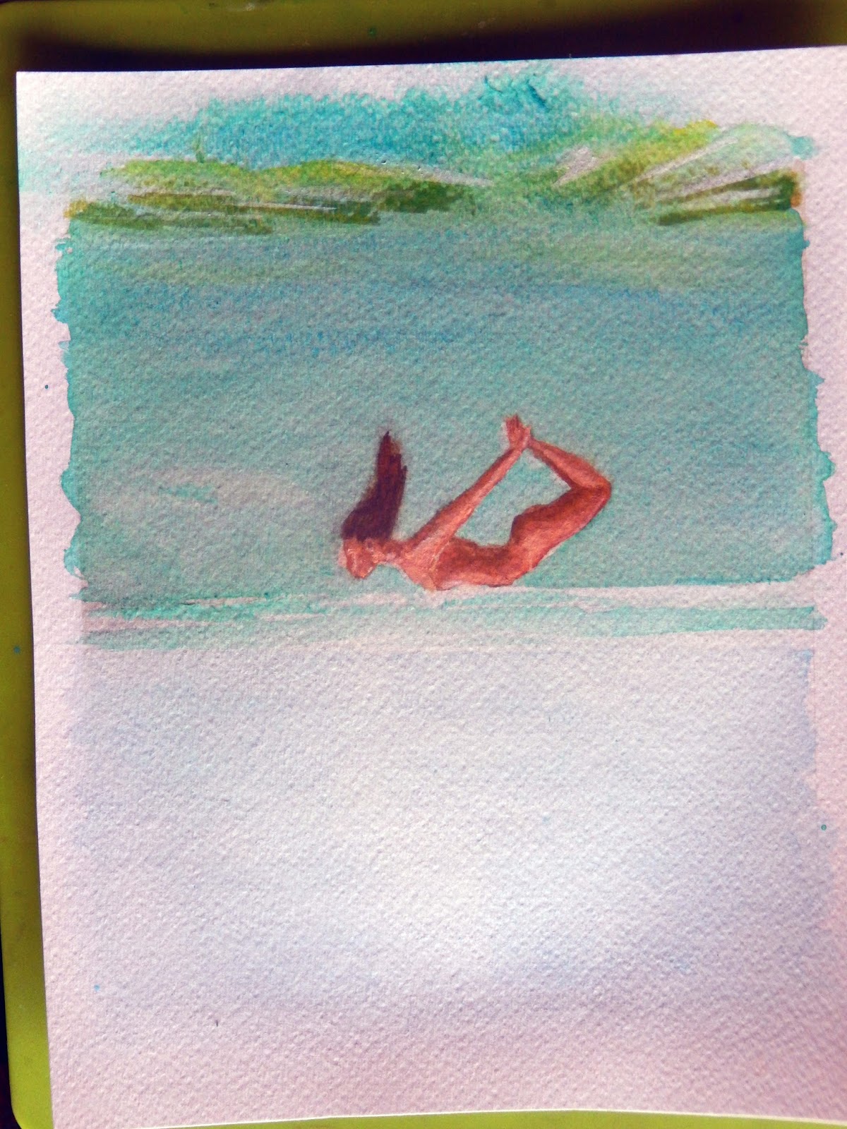
Well the following paint involves more wash than glaze but both technics were applied;
Maybe you have thought that layer after layer of watercolor wash will produce a dull opaque look, so let´s check the rules first:
Make sure to establish a damp bead before painting
Try not to push so hard with your brush, while you are painting, use lighter brush strokes
Shorten the distance and reléase the color from your brush more often
Remember to mop up any excess color when you are finished
There is no need to rinse out your brush at the end, just blot your brush well each time you mop up
This is the final result of this process
"The girl in the red bikini holding its breath"
In any subject to paint; First identify what colors on your palette are "transparent". (see a useful list at the bottom of this entrance)
Remember relative opacity or transparency of colors tends to vary from brand to Brand
Now if you have painted a transparent stainer and it's completely bone dry you can expect it to avoid removal.
On the other hand, if you paint with an opaque color derived from mineral compounds that float on the papers surface when you glaze over it with another color, it could well lift (and mix) leaving a muddy look.
Paper to use: The surface should be "cold press". Hot Press surface does not work well with glazing techniques.
I like to use a very heavy weight paper - Stretching becomes superfluous since the papers heavy weight eliminates most ripples.
In my example, I define the forms and colors first and work from them
I tilted my painting in order to get a better blending turning the paper upside down so pool of painting do not form over the edges and carefully wet the paper, only where the wash is to be applied
PAPER: Must be completely dry before you attempt to apply the differnt wash before the last glazing color, if it is not it will mix with the next layer losing transparency of the colors and defeating the whole glazing process.
Just apply a little patience between layers.
A glaze is also useful for unifying several disparate parts, for adjusting and balancing the color (colour) of an area, for creating a shadow shape that guides the viewer's eye and for softening the masking fluids hard lines.
But most important, a glaze allows you to control the values within your image and ultimately the contrast of light against shade as determined by our friend Value, that is what your painting should be all about.
Now you might be thinking a glaze is a series of brush strokes, which it is.
Also think of it this way, wet the area to be glazed first, apply the pigment and tilt the board to encourage it to creep and merge over a portion of the wetted area. Be sure to take a tissue and gently dab the edge of the wet edge, if you don't you might leave a tide mark.
You might also apply several different colors colours to a pre-wet area and allow them to blend or merge into a gently undulating glaze, which is far more interesting then a mixed up color.
In this exercise I use washes for quick shading, and glazes for colour tinting, as well as shading.
But do not forget glazing will produce a much smoother shade, but the process is more time-consuming, and fiddly than washing. But, glazing will produce higher quality results on the end product. If you need to save time, washes are the way to go. If you want a smooth transition of colour, and higher quality end results, then glazing is the preferred method
Remarks and final notes
Watercolors through which you can see the white of the paper or an under laying color.
Aureolin Perm. Rose Rose Madder
Cobalt Blue Viridian Hookers Green
Prussian Blue Antwerp Blue Sap Green
New Gamboge Raw Sienna Quin.Gold
Burnt Sienna Quin. Burnt Orange.
Vermilion Quin. Burnt Sienna
Perm. Magenta Perm. Mauve
There are others.
These colors are all very transparent. Shown are Viridian, and cerulean blue as the non transparent as you can see through out the different wash applied
Each color was a single stroke. Each was bone dry before the next color was placed over it.
Look carefully at all the different colors. NOW DO YOUR OWN.
All colors are non-stainers.
A "general rule" these will be transparent non stainers.
Cobalt Blue, Viridian, Aurolin, Permanent Rose.
The following are normaly semi-transparent non- stainers:-
Prussian Blue, Sap Green, New Gamboge, Raw Sienna, Burnt Sienna, Vermillion Hue, Quinacridone Burnt Scarlet, Permanent Magenta. as a useful guide for your own works