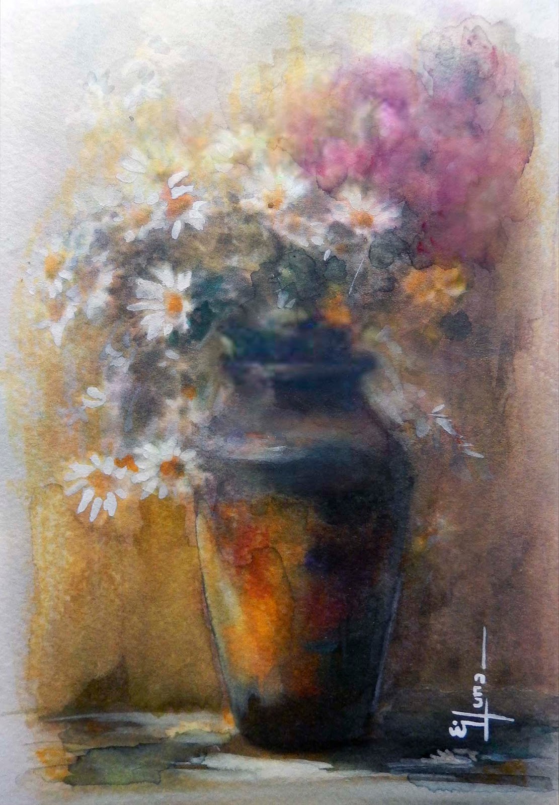
lunes, 29 de febrero de 2016

Ref 997 Watercolor highlighted with water based ink
             (ref. photographs)

Once paint has been applied to the paper, it can be manipulated in many ways to create a variety of textures. The paint can be pulled out, moved around, partially removed, and/or mixed with other chemicals, as in this case, -- Rainbow it was highlighted and integrated with "foray highlighters- wáter base"


         "Traveling – it leaves you speechless, then turns you into a storyteller.”
 
 
Main steps.- airplane silhuette
Filled with pencil 2B, basically edges then mask it, the idea is to have a contour shade for final detailed stage
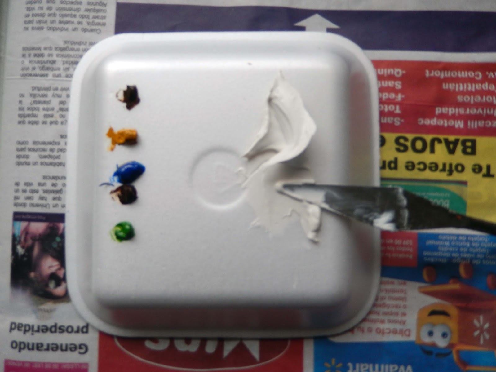
I prepare and poured paint tilting the painting accordingly, to prepare my color references


The idea is to integrate watercolors as underpainting base
 
I start to reinforce color´s rainbow with watercolor pencil, red, orange,yellow,green blue, indigo, violet, and with a sponge brush damp it out, to integrate rainbow´s colors among them - (I lifted out some excessive color from it)
 
 
As you can see  the rainbow´s colors are still so pale, but will be the base for next steps as now a complete underpainting
 
 
I start to use my "Forey highlighter wáter base colors" accordingly
and with a flat brush I added wáter over them .- the color became more vivid as you apply them
 
 
The sky around then was integrated with darker hues
The masking in the plane was taked away
and all details added (White color is gouache)
Finally, I made a cut closer


viernes, 26 de febrero de 2016


Ref 996.- Watercolor.- Mixed with Iridescent Médium

Contains fine particles that add texture to the watercolor. It can be applied directly onto the paper or mixed with watercolors first.
Iridescent medium give pearlescent or glitter effects to watercolors. It is particularly effective when mixed with transparent colors over dark backgrounds.

This is the result of this process;


                     Taken with and without flash


Main steps;
Is a decorative watercolor medium that doesn't get much use, but works pretty good  . When mixed with paint or applied on top, it creates a pearlescent effect. This can be fun to experiment with, but be careful you don't contaminate your watercolor pans. I´m diluting with wáter and dark color paint to use basically for shadows spots to give a brigth and dynamic atmosphere into the painting.-- Be careful to stirring before brush and/or sponge application  due those particles  are heavy and also mask some of your areas before painting
 
 
                                              iridiscent particles on painting solution
 
 
                                           (close-up) iridiscent médium deposited on paper
 
After iridiscent paint solution application it is better to fix the paper, in order to avoid to reactivate it and left as it is.- Then you can start to watercoloring as you use to
 
 
Take away the masking zones and as final touch I did a yellowish glaze
 
                "Plant a seed of friendship: reap a bouquet of happiness"


jueves, 25 de febrero de 2016

Ref 995.- Watercolor .-  Modeling paste as underpainting (selectively in darker spots)

Modeling Paste can be used to create a textured ground for painting, for collage, for relief sculpture, etc. It dries opaque white, hard, and stiff. If its applied on paper might be in a thin layers to avoid cracking, in the following painting I used in a selective way and basically to créate the dark-spots background
This is the final result of this process

                       
                         "The greatest power is often simple patience"

Main steps; Base on the topic, we need to planning, which will be our darkest colors
and mix them accordingly with an spatula, Mix those colors with modeling paste


Once colors ready spray slightly the paper to have a better adhesión (paper needs to be over a stiff surface)
 

The thickness of painting should be mínimum (because we are working with paper, in a canvas there is no issue with the thickness) therefore with and old and worn brush, we cover the assigned dark áreas mainly, as this is our background before modeling paste dries I added with plastic sponges different textures for rocks and brushes Note.- the color should be not so dark in order to later on paint over it and have different random colors, depending on the brush pressure


After application is dry you colors will be permanent it does not matter how much dampen again the paper surface on those painted spots, that´s why I like this technique
Now you can paint watercolor as you use to; im my case above the worked underpainting I add light colors to combine with color underpainted, and I like to lift color with absorbent paper to give many gradual colors regarding the mist on this scene, and of course you can re-define as much posible with darker tones

 
Wait to dry and in order to make it better I add additional modeling paste (natural color) to créate wáter texture as foam or other áreas you want to enhance for 3D likeness within this proportions,
 
Finally I´m layering a Green viridian glaze to uniform the whole painting keeping White tones in just some áreas to represent the light


lunes, 22 de febrero de 2016

Ref 994.- Watercolor / Double masking layer within the painting process

This is the final result of this process:

                                   "Windy and rainy Sunday"

To get the most out of masking fluid, it should be considered very carefully at the planning stage of a painting. In most cases it is applied before any paint comes into contact with the paper
I have learnt that sometimes masking fluid can be too thick if used straight from the bottle. I often water it down to aid the flow of the masking fluid onto the paper
To planning masking fluid lines and saving lights I sketched with watercolor pencil main reference lines, I added masking fluid with fan brush, with the edge of the spatule, and with an old round brush "thick and diluted" accordingly


Masking fluid can be painted, drawn, spattered, dabbed or flicked on to your painting surface. Spend some time experimenting with some of the effects and marks that you can make with the different tools that you have at your disposal. then; I start to pour painting with the help of a sponge basically with colors I´d like for background, I lifted paint also to achieve different color grades
When assessing the application of the masking fluid, don’t keep the brush resting on a saucer or on the table – pop it back into the soapy water solution to prevent it drying out.


For this particular proces I´m spraying wáter right after and take away part of the masking fluid basically where there is dark color background.---Always leave the masking fluid to dry fully before over-painting too. To check this, carefully touch the masking fluid with your finger tip. If some comes away, then leave it for a few minutes and re check.


There is still several lines of thicker masking fluid on the paper which I left for the end
at this stage I start to add deep color to conform the shape ideas take form

 
After dark tones, and shadows are painted, I´m taking away the last lines of thicker masking
Some artists use a soft rubber to remove the masking fluid from the paper. I remove it by gently rubbing with my fingertips, but only when I have checked that the paint and paper are both completely dry
 
 
Finally Masking fluid can leave hard-edged marks on your work. If the wash painted over a masked area is not a staining colour, then once the masking fluid is removed the edges of these marks can, if desired, be softened by gently lifting out with a damp brush.

sábado, 20 de febrero de 2016


Ref 993.- Watercolor.- Portrait with a limited palette

We all know painting a portrait is a challenge, but the idea of painting a portrait in watercolor can be downright intimidating. Watercolor is notorious for being unforgiving,

                                                 "photograph handmade by the uncle"

I did this portrait with basically 3 colors cerulean blue, raw umber and violet
When you’re first taught to paint with a limited palette, you’re usually given three primary colors—red, yellow and blue. Limiting yourself to just a few colors teaches you how to mix colors correctly, see value and temperature, and encourages thought and planning in your color choices.
You’ll also notice that colors in a limited palette can still be warmer or cooler in relation to other colors. Since the eye adjusts to what it looks at, it doesn’t feel as though any colors are missing. There are cool and warm reds, cool and warm yellows and so on.
First Drawing: I drew this piece in pencil . I always work from the general to the specific; from the flat/graphic shapes to dimensional forms. Accuracy of proportion and anatomical forms serves as the groundwork for the subtler, interesting problems associated with the sitter’s character and expression.
Underpainting: Once the drawing was established on the paper, I blocked in the general color scheme of the entire picture. At this stage I worked relatively quickly, going from dark to light and using fairly thin paint—you could also call this an “underwash.” My goal was to make a first statement in value and strat from there to indicate main features

Ref 992 Watercolor; Zooming in on the use of photographs

             "Friendship is not a big thing; it´s a million Little things"
 
Photography is asubjective médium, The camera´s eye and the human´s eye do not see reality the same way.- Some painters reject the camera, saying it is a hindrence to their creativity, others regards the camera as a valuable reference tool.
I´m making paintings from photographs, altough I want my work to give the illusion of great accuracy, the painting is always quite different from the photograph refference, simplifying the work by removing details, like clothing, patterns or blemishes and créate just a few textures clarifying the piece by making lines and forms more pronounced, removing out of focus fuzziness and add detail where it may be washed I want the viewer to imagine that there is more happening outside the frame but focusing in a still time fraction of it

viernes, 19 de febrero de 2016


Ref 991 Pastel /.-  Creating unstatic figures

Loose lines gives the figure a vigorous feeling, the loose scribled marks enliven flat areas

Ref 990 Blotting Watercolor

This is the result of this process: (over cold press paper)

                       "Happines has been occasionally to blow bubbles"

I know three easy ways to lift out color;
With a clean moist brush
Scrub out color with a stiff brush
Bkot up color with a tissue

I did for this particular painting  mainly the last way, is an easy way to lighten the value of an área just painted, how much watercolor is lifted depends in how wet or damp your wash is or the amount of pressure applied with your tissue
Take a dry tissue and crumple it in your hand, this break up the sitifness, but if you are looking for texture, crumple it more, if the tissue is also wet can lighten even more


sábado, 13 de febrero de 2016

Ref 989.- Mixed media.- Watercolor and color pencil

Colored pencil can be a useful addition to other media, adding texture as well as be using to define and clarify a drawing previously worked, you might try a different  methods such as I´m working here, the eyes are the main part and focus attention so as I did time ago with the raven in wich I focus the attention into the eye with watercolor pencil and colored pencil, this time I´m doing just with colored pencil.- Both colored pencil and graphite lines have been used playing and important role that otherwise soft-focus watercolor rendering
This painting has been worked it out over hot press paper

                       "The parrot of the Clown"
Ref 988  Watercolor Lifting out painting dragging it out

Lifting out method; laying a loose wash in determined wet área and lifting out paint by pressing with a paper towel, different amounts of color can be removed by variying the pressure; finally add touch of definition to the foreground working wet on dry

 
        "The words, gone with the wind, but the painting experience will remain"


lunes, 1 de febrero de 2016

Ref 987;.- Watercolor; Pouring paint in most of the process

This is the result of my particular process;

"Evanescence on stage singing IMAGINARY"

           ~ In my field of paper flooowers
                    and candy clouds of lullaaaaaby
                           I lie inside myself for hooours
                               and watch my purple sky fly over meeee.........~


The following painting is one of my first pouring painting try, onto wet paper, manipulating it slightly and allowing it to dry, then go back into the painting to finish it into an image you want to.
I start by selectively wet the paper according my sketch while the paper is drying to a light sheen, I select the tubes of watercolor paint I wish to use.  Generally using two or three colors is enough, Choose colors you love, keeping in mind what they do when they mix together. (i.e., mixing complementary colors usually creates mud)
In a small cup I mix about a 1/4 to 1/2 inch squirt of paint directly from the tuve. Then add water.  I squirt it in with a spray bottle, a little at a time.  You want the paint to be fluid, but not watery...like milk or cream.
I mix all of the paint cups before pouring.  So, if the paper has become a bit dry (lost it's sheen), I may mist it lightly with my fine mister bottle, then begin the pouring process.
As you begin the pour, you must be thinking about design principles.  Often the cruciform is the best pattern.  Some people pour with a subject in mind. If you move your hand while pouring, you can get the paint to move out into a line and fill the page more easily.
I usually use all the paint from each cup.  I choose the darkest color first, adding the lighter ones on top.  Doesn't always work that way, depending on the pigment.  You have to experiment.

As I add the next colors, I am following the first pattern laid down by the first color. Overlapping some, but mostly keeping them close to one another
To FINISH you simply allow the images to appear to you.  Turn the paper around to look from different directions (maybe you poured it horizontally, but it makes a really lovely vertical).  Let the piece speak to you to see what it wants to be.  If you use more paint, USUALLY it is advisable to stick with the same colors you used to pour, not to introduce more colors,
I completely with a few brush lines to indicate and represent what I intended to reflect, this painting is not 100% pouring paint I had to raise paint and define forms but I guess 70% was made with pouring intent

Bonus Painting
Ref 986 I was trying to mix opaque and transparent painting over light colored paper this particular experiment didn´t work at all but anyway here is the result

                                                 "The mad woman is mad again"