martes, 28 de junio de 2016

Ref 1054.- Watercolor // Watercolor over stardream Mars color paper

An easy Project which require as material
Stardream "Mars color" paper 105Lb (Note: This particular paper is not precisely made for watercolor but works fine; following the next steps, and we take advantage of its base color for our purposes)
Colors needed;
rosa madder; lemon yellow; ultramarine blue; violet; indigo blue in watercolor
permanent white in gouache
Round brushes
Derwent graphitone very dark wash 8B


1st Step.- For the figures I did use pencil for the rest of guiding lines I did use Derwent graphitone 8B; which dilutes with wáter and form the dark underpainting I´m looking for, The round brush I´m using is in some way hard to draw also with it 
The black color of this pencil reactivates every time you add waterso keep in the áreas needed


2nd Step.- The color scheme here is a simple one, based on the contrast of the colors indicated, I applied the yellow mark, to give me a reference in how I need to play with my colors at the sky
As you can see only the pencil lines of the figures still are indicated within the paper .- Note now my brush is softer because I´m just adding color with wáter trying not to disturb dark colors below


3rd Step, let it dry as you progress and have fun adding colors without fear
Now some dark watercolors start to be added to define forms

 
4th Step .- Final definition The permanent White of gouache gives light so I mixed sometimes to give more values accordingly.- nevertheless the color Wheel is quite importanto to muted secondaries, the primary colors farthest apart créate more muted mixtures, which could be useful for crating shadows
 
WELL HOPE YOU LIKE IT;
 
                    "I want to be your favorite hello and your hardest goodbye"
 
 
Now a series of pictures of a painting I didn´t like at all but which process was interesting just for the record ref 1053 I did repeat some process twice due I wasn´t satisfied


Ref 1052;.- Another fail .- Because I didn´t paint the background first and I screw it up by the end
MIXED MEDIA.- Modeling paste, graphitone & gouache as underpainting highlighted with acrylic painting over Stardream silver color paper

lunes, 20 de junio de 2016


Ref 1051.- Watercolor // "Experimental exercise" over Stardream Sapphire color paper
Notes:
Trying to take advantage of the paper original dark color
Experimenting what is better; a).-gouache and/or diluted gouache to paint above with watercolor or b).- watercolor mixed with gouache for medium values (in this case the light blue) and works better the first (a)
Underpainting is black graphitone pencil to start defining main shapes


domingo, 19 de junio de 2016

Ref 1050; Watercolor highlighted with pastel over Stardream litmus color paper

martes, 14 de junio de 2016

Ref 1049.- Watercolor// texturizing mostly with an old toothbrush
                                   over Stardream silver color paper

 Experimenting with this type of paper the following Project involves  a splatter technique through different areas.  It’s a technique almost uncontrollable but gives a sense of mystery and overall highlight to the painting process. 
Spattering can´t be controlled easily, so it is better to mask with torn paper, however I found that in this type of paper it is easy to dissolve painting drops and lift out with an absorbent paper so I didn´t
This is the result of this new Project


1.- As I´m experimenting I tried the use of graphitone to sketch basic reference lines (the graphite of this pencil is wáter soluble so doesn´t leave pencil lines at the end and also contribuite to build up shadows, I did sketch in a loosy way taking care of the perspective

 
2.- by past experiences with silver color I reinforce the brushing wáter addition;  with black color to form most of the shadows I´ll need


3.- This type of paper it doesn´t work like the watercolor paper (absorbent) it is in some way waterproof at the begining but litle by litle  as start to moisten, accept the watercolor, nevertheless you can take advantage to work with textures and if you are not pleased you can try it again without disturb it.- Then with a plastic scourer before the paint dry I starting to add some texturization for foliage


4.- At this stage you can do all stains (shades) that you need and also wipe over with and absorbent paper . start to form what you´ll need and are planing trough your head


5.- Next, dip an old tooth brush in desired paint and with your thumb flick the paint onto the paper.  I worked closer to the paper to try and get full coverage of the paint.  I first used primary colors (yellow in this particular case) and also I did use a fine brush to cover all I wanted
 
This is so much fun! Wet the toothbrush, then dip it in a color, practice in a scratch paper  and then  run your finger on the toothbrush so the splatters end up in the area you want. After the yellow splatters, repeat with another colors!

6.-Aim the toothbrush bristles at your paper..- rub your finger against the bristles and spray the paint on the paper. Use a paintbrush to complete your picture - if you want. now was green

 
7.- Now black 

 
8.- Now White (this color in particular is gouache) With this color you need to take care of perspective so integrate just the wáter drops far in the distance with an absorbent paper to fade the color a Little bit and avoid 2D appearance


9.- the puddle of water on the road is the only one with vertical and faded brushe-strokes to suggest reflection


10.- Now with payne´s grey, start to worh with all details once underpainting is completely dry and I start with the boy figure in the place already reserved for him

 
11.- Final touches; the White again is the color that brings 3D and live to the painting - do it careful and above all enjy and have fun
 
 
"Chilhood, Playing After the Rain"
Adulthood; Again playing but now with a rain drops of watercolor paint, thrown with a toothbrush; over Stardream silver color paper


domingo, 12 de junio de 2016

Ref 1048 // Watercolor & Water Soluble Graphite Pencil

I combine the use of Graphitone a wáter soluble pencil, which is a slim stick of pure artist-quality graphite combined with premium clays, graphitone can enhance a lot the project.
Use it like a usual pencil for excellent detail or unwrap the easy to peel paper and set the graphitone on its side for broad strokes. Because it is watersoluble, graphitone can be used for line and wash drawings.
The paper for this Project it is Stardream litmus color paper

And this is the painting result:


Reference HDR technique photo.
 (is a technique used to reproduce a greater dynamic range of luminosity)

I began with a graphitone drawing placing main objects in order to define the proper perspective but a this point I was not worried about getting these elements exactly rigth;  knowing that refinements would take place in subsequent steps, so I´m careful to preserve shapes, sizes and specially the perspective
The litmus effect of the paper it is seen through out the painting steps, the light came from the top so the tone looks different when the photo is taken;
 
 
2.- Step.- The painting is the reinforced with Payne´s Grey where the graphitone will be diluted with the brush humidity along with the watercolor, given different shadow´s effects to be controlled accordingly


3.- I chose to work from left to right, using changes of values for shape suggestions, allowing the viewer´s imagination to fill in the rest, due lot of details, I´m creating texture, correcting color, increasing the value near to bottom adding just shadows with this only color


4.- When satisfied I added (ochre + médium yellow) to refresent light zones, (4a) which will be integrated by lifting color with an absorbent paper (4b)

(4a).-

(4b).-
 
5.- The painting came to live when I add the permanent White color (gouache), the illumination obtained within this color paper Works pretty good, This color is integrated with additional wáter once has been brushed in, basically to give the fading effect 

 
6.- Final touches.- In order to make a better contrast, the graphitone pencil Works again well -- adding the color shadows and wet accordingly.- hope you like this experimental technique
the place is:
 
                  "Bisbe Street Bridge, Gothic Quarter - Barcelona Spain"


miércoles, 8 de junio de 2016

Ref 1046.- Watercolor // Watercolor over silver Stardream color paper, But now texturized and highlighted with modeling paste at the final stage

This is the result of this particular process;

                      "The force of the wave, is in its persistence"

Some relative notes;
1.- Sketching in a loose way the main features with a dark color (Payne´s grey)


2.- watercoloring accordingly


3.- This is the key secret, because now I´m adding permanent White "gouache" in all places I need brigths and shines The gouache has the property to be reactivated in contact with wáter, so you can take your time to apply it - next picture shown where I´m applying white color


4.- Now this picture shown how the gouache is reactivated, when the wáter is just added over the White gouache, this particular type of paper helps a lot to work this methodology but you need to be skillful to work fast and accomodate the color once you´ve got your brush wet to reactivate this particular color


5.- For the final stage I added more watercolor shadows to reinforce some zones but like I said at the begining I highlighted shine zones with modeling paste to texturize a 3D foreground composition (modeling paste is opaque White) but is giving me some additional tones to work with and I´m pleased with this new process so I´ll be working in more examples


Ref 1047.- Fail (just for information)


martes, 7 de junio de 2016

Ref 1045 Watercolor //Watercolor & modeling paste over bronze color paper

Following additional experimentation with this paper, this is the result for this particular process;

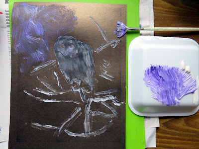
                             "Owl you need is love"

Main Steps:
1.- I did use a small flat brush and a fan brush and a small spatula to add in a loosy way the main countorns in which to work with (to apply modeling base as my undepainting)


2.- Completation (once painting is applied I add wáter where I need to smooth a Little bit the surface and/or cover completely the paper surface with modeling paste as underpainting and also I use additional material to conforme texture if I need to ---- most of the times I colored the modeling paste to take advantage of previous steps


3.- Once is dry this is the appearance so far after apply White opaque color (permanent White  gouache) to highlight some áreas of the painting 


4.- To build up 3D appearance I add with care more modeling paste accordingly


5.- Above this underpainting once is completely dry I watercoloring with a big brush for background and with a fine for initial details


6.- I wanted to add something additional into this painting, so finally I did use pastel pencils just in the owl head and green in some branches, wich also works pretty good over modeling paste