sábado, 23 de julio de 2016

Ref. 1065.- Watercolor & gel ink; over Stardream crystal color paper

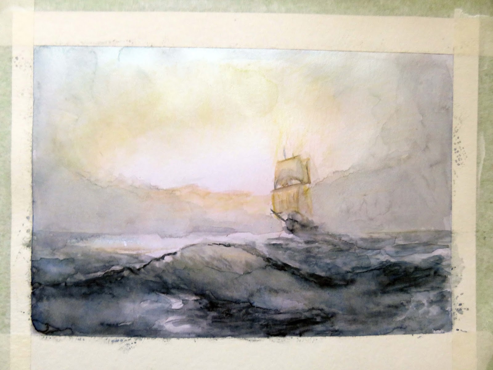
This painting has been made taking advantage of the  clear shimmery surface of this paper is not made for watercolor purposes, but Works pretty good with watercolor paints is quite similar to hot press paper but whith many colors to work with, (weight is 105 lb and the color is refered as crystal).    

 
This is the result of this new project


                    "A breeze, a sunny day, a smile, all can fit into a window"


1st Step  Tip Pure, straight-from-the-tube black is invariably too dark in tone and too consistent or flat in color to make a satisfactory shadow. Mixing a chromatic black is already an improvement, but using a complementary color will produce a more subtle, natural effect
 The logical color to use is violet, being the complementary of yellow, the color of sunlight - I created violet by glazing  ultramarine with red as I wanted to make it more darker I added Brown also, this paper needs several layers to reach the values you need, so needs to wait for dry condition through the different layers
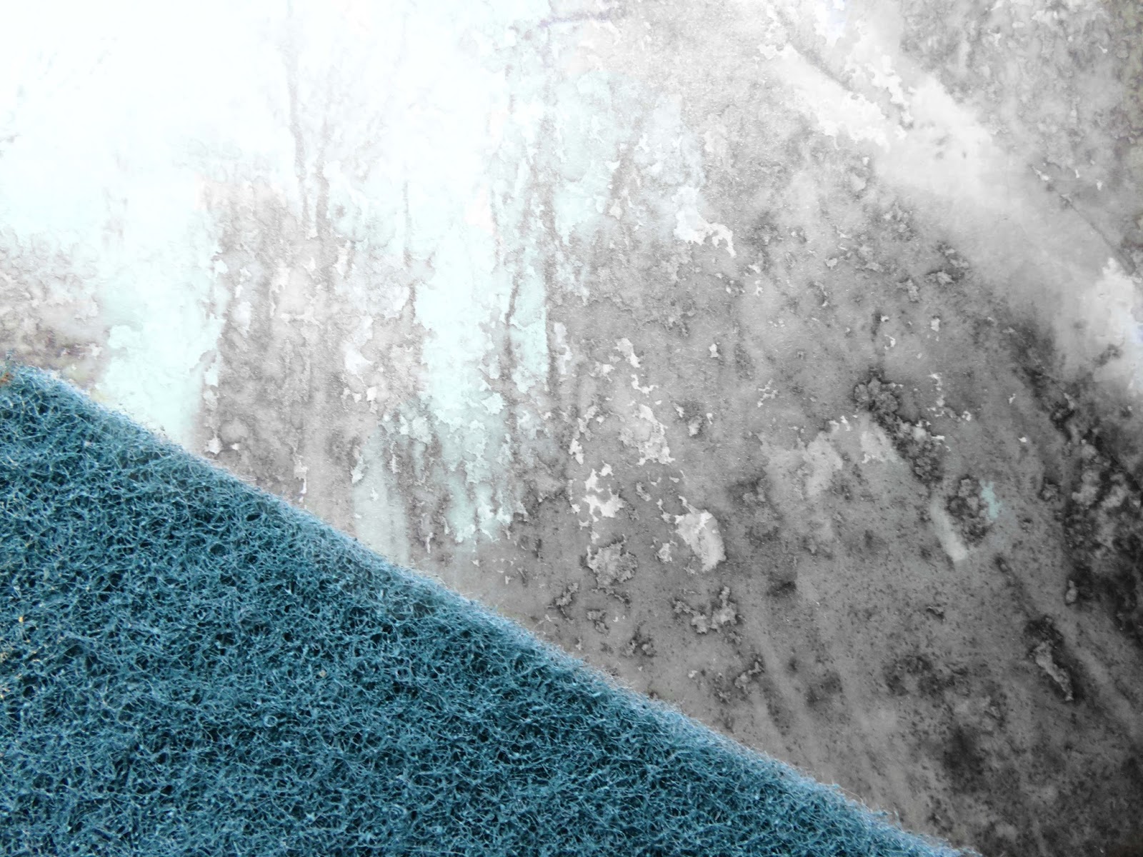
Note.- my initial main guidance lines were made with a brush wet in (diluted graphite into wáter) the graphite over this paper help to texturize painting above


2nd Step.-  Shadows shouldn't be done at the last minute as an after-thought, as something totally separate from the main subject of the painting so I try to mix  my main colors within so now the green mixed with all close around also let the gravity help to mix colors by tilting your painting paper as you progress
 
 
3rd. Step  gel ink in pen, Works pretty good like a fine brush to make fine lines, once you apply it to define forms you can add wáter above now with a fine wet brush and fade them accordingly, I did use because this type of ink has glow particles which will give a shiny condition at the end I did use just Green and Brown in áreas were light is hit
 
 
4th Step As I´m progresing I apply more shadowing with a big brush  from my initial pool and integrating lifting up part of the paint with an absorbent paper, while I´m defining the Green leaves
 
 
Step 5th.- I start to adding permanent White gouache which is opaque White to cover window frames and to form reflections integrating also with an absorbent paper around its applications
I also reinforce the shadows with more pure dark color  (mix of ultramarine and Brown )without use any black color   


jueves, 21 de julio de 2016


Ref 1063 / 1069.- Exercise .- watercolor over Stardream silver color paper

                            "The purling girl" (La chica susurrante)


Ref 1069.- Trying to work in the inner church atmosphere
                Experimental painting

I didn´t get the contrast I needed anyway I´m posting it for my reference
                      "Heavenly music at the Cathedral of the sea Catalunya"


Ref 1962.- Watercolor over Stardream Onyx color paper

                         "When life throws a curve, take it"


Ref 1061.- Watercolor over hot press paper

                              "Never ask a starfish for directions"

lunes, 18 de julio de 2016

Ref 1064.- Watercolor pencil & watercolor brush over litmus color paper


Tools & Materials; I start the sketching with watercolor pencil, which facilitate work accuracy and confidence, they are easy to use wet or dry (I start in dry condition).--- The paper is Stardream litmus color paper 105 lbs. I do believe also known as dolomite color paper it is basically smooth, like hot press, allows me to get lighter strokes , it does not hold pigment like cold press watercolor paper so it is necessary some practice with the brushes to get what you expect.
Main watercolors used are Indigo blue, Payne´s grey, yellow, orange and violet finally completed with permanent White "gouache"
My reference is an oil painting found into the web which now I try to represent with watercolor

Step 1.- Dark blue and black watercolor pencil for guidance and sketching but firs of all;
Paper preparation.- Lay the sheet onto a hard surface and wet it througly, squeezing wáter from a sponge and let it dry, to make easy the watercolor pigmentation addition through following steps


Step 2.- Primary and/or light color pencil addition (in dry condition)
Step 3. there are 4 strips of adhesive paper holding your paper to a flat surface, preventing for buckles as much as posible, therefore I did use an old flat brush (semi-hard by its condition) which help me to rubbing over the colors to mix them and achieve a compacted and shiny effect


Step 4.- Now basically from the center towards the sides, I added with care wáter with a big loose round brush, making eay and faded the pencil mix combination, and many times I tilted like you can see in the photo to facilitate the effect always from light to dark from the light source


Step 5.- With watercolor and brush, is easy to work and start with dark colors---- and colors can be integrated with an absorbent paper lifting it out also adding just wáter you can change hues as required


 Progress of darkening
 
 
Step 6.- AS I said it is easy to add wáter any time you need and integrate the different hues, paper its quite noble but do not overwet, (better wait to dry).- the color of the paper underneath is part of the painting hues of the different áreas so take advantage
 
 
Step 7.- Now the White addition which can mix with colors below depending in wáter added
 
 
Step 8.- Final touches.- White added with less wáter and fine brushes for details and before make my last violet glazing I need all painting be completely dry in order do not disturbe brush lines below which I added in some shadows to make it more colorful
     
                            "People don´t take trips; trips take people"
 
 
Final notes.- My original plan was to paint around a seies of shapes in order to define them;  this practice is know and "negative painting" so you need a careful drwg to assure you can build up a methodological layer.- is a tricky technique but essential for a painting light again dark, at the end I didn´t - I get carried away, by the subconscious but with such technique the painting will be more defined

lunes, 11 de julio de 2016

Ref 1060.- Watercolor // .- Cameras record, painters interpret

This title "quote", its important and caught my attention, when I start to work through out this painting, and base on that I interpreted my photo reference into a painting regarding to communicate an energetic cycling mood base on the speed, the effort, the subject matter, composition frame, colors title etc,

So basically this was a good exercise taking in account most of these points in mind which I´d like to share with you
paper is watercolor paper 240 gr 


Step 1.- Interpreting is the art of not to play what is written therefore after checking my photo reference  I start with pencil  drawing basic and main lines trying to represent a different and/or more interesting view´s point from there ----(As this is one of my first interpretation exercise I wasn´t far away of my reference but was a good exercise to be more creative)


Step 2.- Listen to your intuition.- This time I start by the background but I mixed with primary color (yellows) to represent in some way the speed and ligth through different áreas


Step 3.- With Ultramarine blue, violet and Payne´s grey  I start to conform darker áreas to get my own balance between dark and ligth áreas to start with


Step 4.- Adding from there darker and lighter values to conform shapes as needed


Step 5 Final details  and title

                                                "If you brake you don´t win"

Final comments; I enjoy trying to be creative along the process
in order to do that you need to consider all things you can play with;
tone, composition, perspective,texture, marks, mood form, light, pose, subject etc

jueves, 7 de julio de 2016

Ref 1057; 1058; 1059 Watercolor variances & practices over Stardream color paper


"The Lemur poet, and his happy thoughts"
  

Watercolor texturized with fixative and water spray over Stardream gold color paper - just white is gouache


“The fragrance of the rose, remains on the hand that gives it.”
Watercolor over Stardream black color paper


"Rendezvous at the forest"
Mixed media.- Derwent graphitone pencil, diluted ink as underpainting then watercolor and finally just the yellow color reinforced with pastel pencil> over Stardream light blue color paper


Key step; Chinese ink along with wáter spray lifted up with a plastic sponge to texturize branches at the top of the tres