Ref 875 Gouache .- (gwash), also called opaque watercolor,
Is heavier than traditional transparent watercolors, with a higher pigment to water ratio. It has unique properties and peculiarities, among them an extremely fast drying time, and the fact that colors dry to a different value than when they were originally applied. (In general, lights dry lighter; darks dry darker.) This provides an interesting challenge to the painter, especially if work is being done over several sessions
Because gouache remains “live”, unless it is fixed in some way, wet paint – or a wet brush – stroked over it will activate the existing paint, and the existing paint can mix with the fresh paint. Referred to as “lifting”, this characteristic is frustrating to many people who don’t use gouache very often. Because of my own painting method, I embrace this characteristic and make use of it extensively.
Will the gouache crack? They say it will if applied too thickly. The problem is, I can’t find a definition of “too thick”. It might if done on paper, or any flexible support.
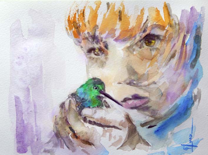
Gouache dries to a matte, suede-like finish. It’s pretty tough paint, and unless the surface is scratched, it holds up well to being handled. Because it dries immediately, I did over cardboard previously covered with wáter-colored modeling paste, framed with tape fig 875A and from there I apply gouache color accordingly
Fig 875A
Like acrylics, gouache dries quickly, even more quickly than acrylics. However, unlike acrylics, it can be reworked months, even years later. A wet brush will reactivate gouache, and new color can be blended into existing paint, directly on the painting. No medium is required other than wáter.
As my work continues to evolve, I find myself continually exploring a wider variation of color, softening edges, and experimenting with brushwork. now I´ll be working with gouache and probably mixed media in more tan one ocassion
Fig 875B
"Color speak all languajes"
To complement this painting I added iridiscent médium mixed with the brillant red, ultramarine,violet and leaf Green to make and additional glowing on the paint
Ref 874.- Watercolor.- The power of edges (part 1)
Shapes and objects in a painting are defined by their edges, making edges a subtle but power tool for the painter to use to develop movement, contrast and a variety of “special effects” in their paintings. Edges are very helpful to identify the important areas of a painting—and the secondary areas. And edges can be a powerful tool to reinforce the “story” that a painter wishes to tell with her/his work
The use of edges, combined with shape, color and temperature, directs the viewer’s attention into the middle foreground, to the important area—the Church and the people around! Creative use of edges, together with other techniques for creating contrast—shape, color and temperature, in this case—help transform a very ordinary scene into an engaging painting work !
The variety of edges help to make a painting work in the way intended!
For simplicity, however, we will consider each type of edge, one at a time:
1. Hard edge
2. A diffused edge in which a defined continuous contour is not evident, sometimes called a lost edge
3. A soft edge that still holds its distinct form and contour
4. Broken irregular edges commonly known as a ragged edge
5. A lost and found edge:
Effects
A.-Effects of Peripheral Vision in the painting
B.-Effects of Motion
C.-Other Special Effects: Soft and lost edges are useful for a wide range of other special effects: moving water, distant objects and background hills, anything in motion, atmospheric effects such as fog, mist, rain, snow, clouds, steam and the like. Soft and lost edges are also useful for visual contrast
My following painting was made from a photography in which I apply Hard Edge where I need attention, & Lost Edge around for peripheral visión effect
Ref 874 "The world is a book, and those who do not travel read only one page"
Metz, at France; (Temple Neuf) et Jardín D´Amour
Ref 873.-Watercolor--- Lifting Color
For my following painting I started with a loosely rose main lines painting, and before completely dry I flooded it with water and blotted without scrubbing very much, and using only a soft brush, so as not to damage the paper. I did not use fitch scrubbers. they damage the paper so that it is hard to paint over it. (Sap green, prussian blue and quinacridone gold, the yellows and magenta the hardest to lift. The easiest were the siennas, orange, and both cobalt and ultramarine blue---washing out to pure White). The others left a slight tint, but not enough to be bothersome unless you want a pure white.
Previous test was done on Strathmore 140 cp. the paper i use most often. but you'll find that each lifts differently.
The rose main and only color, I used it was "Rose Madder from Winsor & Newton"
So the steps just for the rose color are as follow:
1.- Paint the rose main lines with a bliste round brush in a loosely way (watch and take care of White and/or lighty spots on it)
2.- Flooded it with wáter and take advantage to lift paint from it
3.- you´ll see that color rose is now lighter but still defined in some way
4.- After completely dry, paint again just the edges in shadow with same color (now the color is deeper on that zones but nevertheless is blending with light tone underpainting of the same color
5.- This part is to integrate 3 tones in the painting (same color lighter, neutral and deeper) using a tootbrush to rub over the paper and get the lighter tones on it.- I wanted to add additional White color to make stronger impact, in which case needs to be added within the central whitest zones and lightly arond the rose itself. The background have the same treatment to make several tones with same color
Ref 873 There is no plan "B" for passion
Ref 872; Watercolor.- Alternative & Mixed Médiums
there are a number of artists who combine transparent watercolor with various other media, to achieve different effects. These include (but are not necessarily limited to) watercolor pencils or crayons (still watercolor, but in a different form), ink, graphite, charcoal, gouache, colored pencil, metallic ink, pastel pencil, casein, markers and acrylic. The addition of one or more of these additional mediums seems to open up many creative possibilities for the artist. I also included watercolor collage in this section, though watercolor was the only paint used, the addition of layers of different papers does give a different appearance than simply watercolor on a single support.
Transparent watercolor is my favorite medium to work with. I am a relative beginner in watercolor, and I'm sure I haven't made all the discoveries of what I can do with just transparent watercolor, but I also find it fun and educational to experiment with adding other media, just to see what different effects are possible.
The following painting was made with soluble graphite, and phosphorescent markers and with the help of masking fluid, looks dirty, so I´ll try to make with a dark colored paper through out, next time to avoid it, nevertheless the idea was to make a firework with this elements
Celebrate your successes; Find some humor in your failures but keep learning
Ref 871.- Watercolor Analogous Color
An analogous colour scheme is made up of 3, 4 or 5 colours which are located side-by-side on the colour wheel. Analogous colours tend to look very harmonious and pleasing together because they are closely related. It is a relaxing colour scheme, even with a brilliant palette. The eye feels easy travelling from one “similar” colour to another.
If you choose the most common 4-hue analogous colour scheme, no matter which four hues you display on your colour wheel, there will be one primary and three others that all share that primary colour. They are related! Therefore, they "get along together"
Analogous colour schemes can be broken down into warm and cool colour schemes. The warm analogous colour scheme would consist of red, red-orange, orange, yellow-orange, yellow, yellow-green and various values and intensities of those colours. A cool analogous colour scheme would consist of green, blue-green, blue, blue-violet, violet and various values and intensities of those colours.
Usually, when using an analogous colour scheme, one colour or hue is used as the dominant colour while the others are used to enrich the scheme.
"Adventure happens; when there is no good planning"
Ref 870 Watercolor,.- Painting Portraits
Unlike any other médium, everything in watercolor is timing. the second the watercolor wash is applied, it is a constantly moving entity, and is in a different state of dryness. the color pigment suspended in wáter it is constantly changed its carácter as it dries.- with practice you will need to know when it is necessary a wet wash, dump wash or a dry brush as well as the other fundamentals such as the exact momento to charge in a complementary color or perhaps to lift in a haze light, I did additional washes in may next painting combining 2 washes of different colors after initial underpainting or base color painting, so where the two color mix I´ll acchieve the beautiful neutral color I glazed with blue cerulean and ochre in different steps and different required áreas background need to stablish the lightest áreas of the whole painting
Tips in portraits
The eyes in a portrait have to be exact to get the likeness.
Study the shape of the socket, angles and thickness of brow, relationship of brow to eye, line of eye, curve of lids, fold line, lashes, colour of iris, and the lines and wrinkles.
Fold line and wrinklesFold line - shows that the eye is open and the upper lid is folded back on itself.
The look changes with partially closed or fully open lid.
Extremely important line for likeness, observe angles, colour, spacing closely.
Common Mistake: not making the fold line dark enough or not observing its contour.
Pupil
The pupil is a hole – the darkest part of the face
It is always centered in the iris.
It is round unless seen from the side.
It determines the direction of gaze – THEY MUST LOOK AT THE SAME PLACE
Common Mistake: making the pupil off center in the iris, not round, not dark enough, looking in different directions.
Iris (coloured part)Bottom lid just barely overlaps the lower edge of iris and the top lid slightly covers more of top edge of the iris (usually 2mm).
A darker outer edge is common.
Make dots and lines of colour, not a solid shade
Pupil in the center
Common Mistake: too much iris showing, not round
Highlights
They are the brightest part of the face and often surrounded by dark
Hard edges of reflections show a wet surface.
Highlights follows curve of eye.
A whole other story can be shown in the highlights. They can reflect the light source, surroundings or the photographer/artist.
Common Mistake: not observing highlights accurately
Sclera (whites of the eyes)
Not really white – save brightest white for highlight
Pinker toward inner corner and a little pink on outer corner
Most of the shading showing the eyeball is round, occurs on the sclera. The values can be very dark.
It can reflect local colours in it.
Common Mistake: flat, white sclera and forgetting the shadow under the upper lid
Lashes
Unless close up, only suggested
Grow from outer edges of lids
Length varies and width tapers to ends
Tangled, down swept then up on top lid
Not evenly distributed across lid
Common Mistake: start from wrong place, too uniform, too long.
Ref 760 Family is not an important thing; it´s everything
Ref 869; Watercolor.- Planning - How do you go about ?
The question I had in mind initially was, how to go about, but thought , since there are a wide variety of approaches, subjects etc.., painters , I thought it might as well as in more personal terms.
I realize the question is a very broad one, but things am thinking are some like below ( in no specific order ):
1. Given a subject/sketch/reference in front of you and a plain watercolor paper , how do you go about it ?
2. Am thinking, stuff like, how do you seperate areas that you will work wet-in-wet, or as independent sections etc..
3. How do you bring about harmony of colors across the scene ? Do you work all over for achieving that ?
4. How do you skip from one area to another ? Do you plan ahead, to specific details ?
5. How do you work your shadows ? Do you lay in base tone and then go over at a later stage ?
6. Light-to-dark, back-to-front ?
7. Or... one object at a time ??
Then I start making main lines to go from there and complete the idea
Then when I've painted it inside my head long enough I turn to the paper and paints - et voila! - it begins to appear. Not exactly like I imagined either. Here's one that took 4 or more hours to plan and imagine - and 45 minutes to paint: as an idea
"To improve you need to change, to be the best, this change needs to be often"