
Learning how to get the best posible results when mixing your colors come in time with knowledge and the right amount of practice,
It is easier working with picure references but before mixing watercolors, I take some time to familiarize with their performance on its media in question.
Final result of this process;

Main steps
As thumb rule; I start with primaries lightest watercolor either spot protection and/or application over previous made sketching (for the following example and base on latest painting´s result,
1st step.- I did a graphite solution in wáter (powder charcol mixing with wáter) to make additional underpainting refference texture regarding the forest-Project underway (over hot press paper) and after wait to dry I washed - dry again and fixed (Note.-this step is not precisely mandatory for this Project)

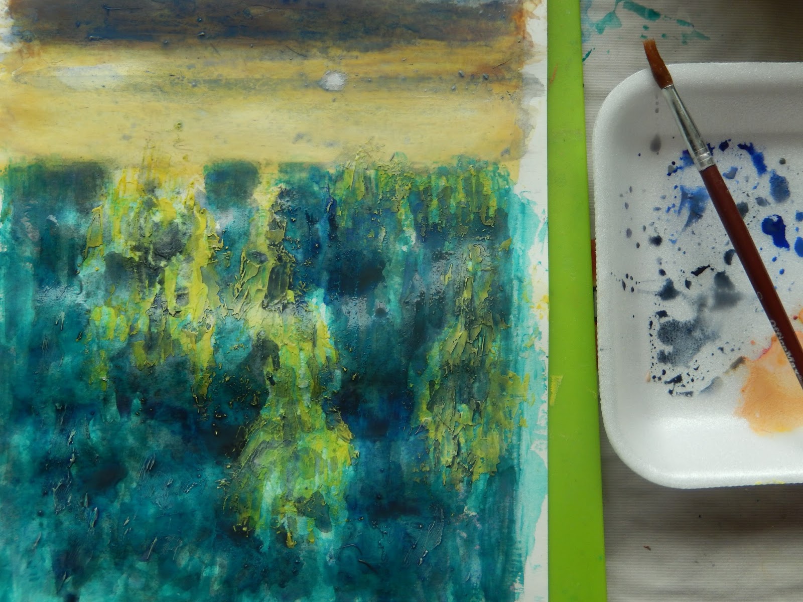
Step 2.- As you can see in the following picture; the molding paste mixed with watercolor, when applied over the painting sketch didn´t cover the graphite lines underneath, so the dark color will remain as a guide to complete the watercolor painting.- the spatula let us make smoth or coarse surfaces as we need, the color needs to be around the average color of the final painting result in mind or the lightest color

Most of this step is applied with spatula, with different grades of color and the texture can be made as painting dries, you can use a plastic sponge to créate more coarse texture if you need in some particular areas

Step 3.- If the painting is not completely dry, with a brush and wáter you can soft some áreas if you need and add more additional colors and/or wait till completely dry to go to the painting itself
Step 4.- This step needs to be after completely dry to block the undepainting colors below (you can fix if you want but is not needed at all) I start by making some color testing which as you can see do not mix with painting below even you add big amount of wáter, so now you can complete the painting
Try not start your puddle with lots of wáter, it Works best to mix your watercolors to achieve the color and value first and try not to overmix your colors
Note for glowing color stay with colors that have not been pre-mixed with their complement You can use two transparent colors and one semi-transparent, the non-staining and transparent properties of the pigments allow each of them to intermingle beautifully on the surface ( see previous ref 905 to check color transparencies list)

Step 5.- The darker colors added over the underpainting now have more body and clean effect, I like to work with contrast so complementary colors are ideal for that ---I wait to dry before cut and the painting is ready

No hay comentarios.:
Publicar un comentario