viernes, 29 de septiembre de 2017

Ref 1219; Acrylic & Watercolor over texturized Stardream
                 colored paper


"The Great Blue Heron"
Some note about Stardream paper .- Rich in both appearance and quality, Stardream paper is manufactured in Italy by Gruppo Cordenons fine paper mill, a fourth generation family paper mill that has an impressive environmental charter and unparalleled standards of quality and longevity. Stardream is heavy metal free, acid free, pH neutral, fade resistant, and archival.
8 1/2 x 11 card stock - Stardream : This thick, heavy, l05lb letter size card stock  has a shimmer, pearlized finish on both sides. . Due to the heavy weight and unique metallic finish of this card stock fits pretty good for the following project,


Graphical sequence; 1st. watercoloring pencil for initial sketching after attach the paper to a board with masking tape, because we´re going to use plenty of wáter this time
(note this paper does not need to be stretched as watercolor paper, but I need to keep fixed to the board due I expect some warpage through out the process


2nd.-  I pass paper to clean it out pencil residues as much as posible, my intention is to see the sketch once modeling paste be lay on it

3rd step.- with a spatula I apply modeling paste where White will be the planning color in that área.
As you can see the modeling paste is semi transparent depending in the thickness applied, and considering I´m using paper base instead of canvas I thy to minimize the fhickness as much as possible

 
Then I prepare colored modeling paste (average color of my planing intention,) mixing this tipe watercolor with modeling paste to be applied as well with spatula over the paper


Ongoing process

4th Step (important step) with my fingers completely wet I pass them over the modeling paste just applied (before be dry) on order to get a smooth surface once be completely dry


This is how it looks like once dry

 
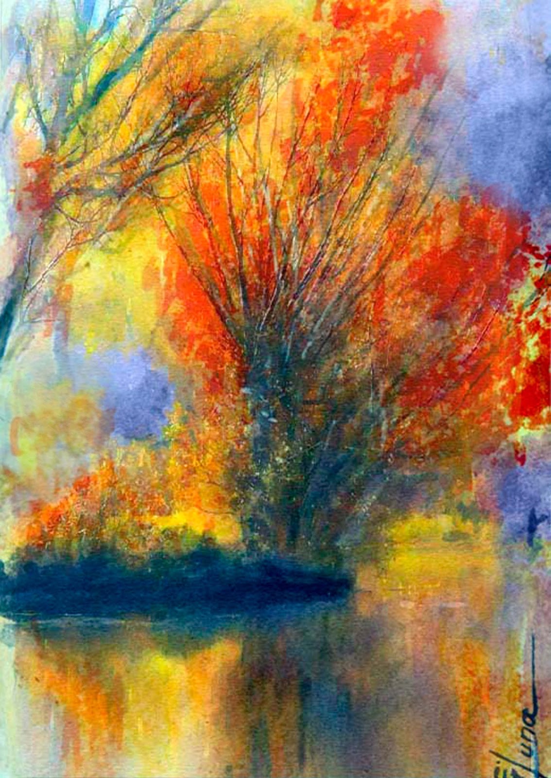
Now with acrylic painting I start to define the different shadows and ligths and features definitions of my painting
Note you can do also with warercolor, but acrylic pigmentation Works better under this condition and is more noble because you can cover again over it once becomes dry without disturb underneath, with watercolor you need to add more wáter and modeling paste can be affected by additional humidity due is minimal thickness added into this Project, so acrylic cover fast and better with minimal amount of water 

 
Finished and completed

lunes, 25 de septiembre de 2017

Ref 1218.- Acrylic over texturized Stardream colored paper

This time I´ll be working with acrylic.- watercolor can be a fun medium. It creates beautiful washes of color that can be a joy to brush onto paper. But, watercolor can be a problematic medium. Because of its transparent nature, it’s easy for an artist to lost control of it. Overworking can be a real problem. When watercolor dries, it lightens up and appears pale and faded.
With acrylic color remains once dries and you can work above without disturb underneath with no special care
The main steps are indicated below:


"The Nature sound through morning mist"


I decide to make this Project over Stardream colored paper, for two main reasons; Take advantage of its natural color (Aquamarine color 105 lbs.) to combine as background and its resistance to wáter (if work with some care) I use to work with canvas on cardboard which is the best base for this type of job but this will be a new challenge

1st step Paper need to have some humidity on it so I pass a sponge with wáter over the áreas I need to attach my colored modeling paste, which I use to apply either with a fine spatula or with an old flat brush (needs to be hard enough to support the modeling paste on it)


2nd step, Before modeling paste become dry I pass  and/or apply wáter to smooth a Little bit the surface, because will make easy the following steps to paint with my round, angular or filbert brush and then you can scratch conform and or edge some áreas for future painting references


Note in canvas over cardbore the wáter addition is not problema but with paper I attached with masking tape to a plastic board i 2 sides of it because will be difficult to attach in 4 sides this type of paper


3rd step.- I start by adding shadows and saving whites as much as posible, in watercolor paper it is better to work from ligth to dark but with this technique is opposite

To remedy my watercolor issues, I started using my acrylics as a watercolor instead. When diluted with water into a transparent wash, acrylic looks exactly like traditional watercolor paints. But, there are a few differences in them, which make me very happy. First, each wash of color will dry true to their color. They don’t dry lighter like their watercolor counterpart. The colors stay as deep dry, as they do when they are wet. No more surprise fading over


4th Step.- I like to use diluted acrylic when creating a silhouette landscape as well
You can treat acrylic somewhat like watercolor when you dilute the paint with enough water. You can use the watered down paint to apply translucent washes on your surface. However, unlike watercolor, the acrylic paint will set permanently. Mixing wash and dry brush methods can be very effective in creating a variety of textures in a single piece .- So base on that I mixed Little bit of cerulean blue into White and then diluted for next step

 
5th Step.- Then You can emphatize the river painting working as a negative painting adding shadows between some lines previously added with the edge of the spatula taking care of the natural flow of the river stream. for the mist I just added more wáter as it drys and integrate with absorbent towel until get a suggestive mist
 
 
6th Step finish details ,. nagative working has been initiaded also into the calm side of the river (left side, but with use of just brush in a vertical way to suggest the land and rocks upper reflection
However into the rocks I completed more with ligthed colors applied with spatula to give additional rock texture on it
 
Final step is to glaze with dilured clear varnish and more varnish among the rocks which needs to look complete wet


sábado, 23 de septiembre de 2017

Ref 1217 Watercolor .- Part of texture technic, has been made by sprinkle watercolor powder over the paper; then spritz water with a mini spray to avoid flat colors

"Lush Greenery and Dappled Sunlight"


Ref 1216  Experiment in watercolor over Fabriano cold paper

Psychological experiment, In my case.-painting as fast as it is possible for the unconscious and intuition to emerge and take command in some way -----i


Ref 1215 Watercolor over Gvarro 240 gr paper

"Love is in the hair
love is in the hair
La la la la la La la laaaa"


Ref 1214 Watercolor now, over hot press paper 140 gr

Ref 1213 Just a watercolor exercise over Gvarro 240 gr paper

"Watching the horizons,gives you dreams,
ideas and paths, so set your goals"


Ref 1212 Mixed sandwich technic sequence.-
                  Watercolor - ink - watercolor


          "Who is ready for Autumn; pumpkins, spice and everything nice"


Graphic sequence

Wet on wet sketching plus skattering crystals of salt to create texture over some masking lines and/or spattering


 1st step watercoloring once its throughly dry

 
2nd Step.- Ink lines and shadowing with brush


3rd Step Once completed, watercoloring again dripping the brush in soapy water, integrating with absorbent paper basically into the water reflexion área

Ref 1211. Watercolor and ink exercise

>>>"What happens in this ship, stays in the ship" <<<
Use for the first time of a new set of watercolor pan, however, the paper wrinkled and torn, despite stretching before, so I just finished quickly with an ink pen, instead of just using watercolor as my main objective


martes, 5 de septiembre de 2017

Ref 1210 Watercolor pencil over Strathmore 500 colored paper

The effects you achieve depend not only on how you apply the pigments, but also on how you add water. I usually scribble tone in with an energetic zigzag effect. Then I wet with broad areas of water applied with a soft brush, yielding a blended wash with a bit of a linear pattern remaining. You may prefer a more controlled cross-hatching to achieve this broken tone–try it. Use a single color or as many as you like, either simultaneously or one at a time, washing with water and allowing it to dry before adding another

This is the result of this particular Project; working over Strathmore series 500 Brown ligth colored paper


           "Farewell on a date of love"

Basic steps;
1.- Watercolor pencil main idea sketching

 
2.1 .- Smooth Pencil, Water Added Lightly
I applied this blue with a fairly even application of pigment–nearly flat, fading to a relatively smooth but light application to the right top. Then I quickly and lightly added water. It still lifted the pigment to a considerable degree, but you can see the pencil lines under it


2.2 progress
 
 3.- Sometimes I reinforce tones scrumble more pencil over dark zones in a semi.wet condition. integrating them with and absorbent paper and care to avoid to lift up much painting


3.1.- progress


4.- This paper isn´t White so the addition of this color will really enhance the painting
Tip, where the ligths are suggested I moistened the paper with a brush and in the center added the White color spreading from the center integrating again with paper


5.- Final touchs, more definition between shadows and ligths and sometimes I use again watercolor pencils to reinforze some líneas or áreas without added wáter at all, but let it dry throughly to be certain with results, before finish it


sábado, 2 de septiembre de 2017

Ref 1201.- Watercolor over Stardream pink colored paper

"Pink features under the sun"


Visual process: