viernes, 29 de enero de 2016

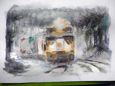
Ref 985.- Watercolor / Powder graphite .- Double texturization


This is the result of apply this process;


Main Steps;
.-- Powder graphite is diluted in a pool of wáter, to be applied in a selective but not precisely way, reserving highlights and White paper, the primary pure color was already added around the beams of this locomotive; The poder graphite in this first aplication is more diluted than the second one to be applied later


.-- With sandwall paper grit No 100, elaborate some forms and shadows mainly at the brushes áreas, after has been completely dry


.-- 2nd texturization; In this ocassion, the poder graphite is less diluted than the first one, and we can apply darker colors with watercolor as needed , once gets dry we apply the fixer to avoid muddy conditions for our following steps, (if needed you can repeat the sanded process, scratch it out, spattering, lift color anything you need on the paper)


I was looking for a darker appearance to make contrast with the snow I´m going to add, so darker color for this example work better, In the next step with an spatula and with old brush I´m adding whites to reflect snow in different spots accordingly and I start to define forms with a finer pencil with dark colors


Finally and once completed the brush detailed job, I start to spattering yellowish paint around the beams and White paint in the rest to reflect an snowing condition


miércoles, 27 de enero de 2016

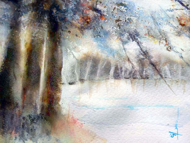
Ref 984; Watercolor.- Mixing some texturization techniques;

For my following exercise; and base in previous experiences, I painted according next steps;
1.- soluble watercolor pencil to indicate main contourns
       (This is because I want to protect White zones since the begining)

2.- Primary colors (The purest colors which I need in my painting either  
       yellow, red or blue   > most of the cases two of them not all of them
       togheter.

3.-powder graphite diluted in wáter and applied with a big brush
      (sometimes lifting color with an absorbent paper regarding distances
        or some particular áreas) in this painting I added before and after
      primary colors :--- before with lot of wáter and after with less wáter to
      avoid muddy conditions, nevertheless I failed some spots (need care)

4.- Wait for dry (sometimes I need to rinse but in this ocassion I did not)

5.- Once completely dry  I sanded selectively with drywall sandpaper grit 100 at foreground forests

6.-  Comercial fixer spray to fix basiaclly the graphite diluted already on paper

7,.- Watercolor accordingly and wait to dry

6.-  With a fan brush I start to spattering darkers colors to suggest additional texture in all the forest
      covering the upper part and mainly the sky, which was already completed

7.-I did some scratching out to suggest some forms

8.-  Above the snow I start to add White (gouache) to highlight the bluish/vilolet color added from the begining

9.- Complete final details (always there are details to highlight)


                                      "Let´s find some beautiful place to get lost"

martes, 26 de enero de 2016

Ref 983; Watercolor, - Powdered charcoal diluted in water and applied
                                        as shadow underlay

To try this texture, first sift a light coat of pure powdered artist´s charcoal onto the dry wáter color paper (already pencil sketched) then spray the área lightly with a pump sprayer in order to help set the texture, rinse the entire paper with clear wáter from a gente sprayer or in a sink, let the paper dry and assess the pattern again, you can repeat the technique for more texture and finally prevent smudging by lightly spraying the área with a clear acrylic laca fixative, over it once has been completely dry you can make the watercolor completation
Note this time I used a small kitchen sifter to make a fine powder texture on the paper


   "Dancing with the feet is one thing, but dancing with the heart is even better"


Ref 982.- Watercolor.- Experimenting with a mixed texturization

As this is my first try to achieve a double texturization, I won´t make precise comments, however following are the main steps to make this paprticula paint:

1-  Selective primary color added according previous soluble pencil sketching;
2.- (texturization) with soluble graphite, applied with brush;
3.- Fixative, (important point for this process to block out previous painting work)
4.- (texturization) bright color with fan brush;(the transparency of the paint it is quite important to cover from dark to light if needed) 
5.- Selective yellow overlay.-(glazing, again the color paint transparency and amount of wáter it´s important for this particular step

The result was not so bad, but my idea was to try better dark tones which are not yet enough (lack of contrast), so in a future exercise the soluble graphite will be added with less amount of wáter and probably I´ll mix transparent and opaque watercolor to achieve a better result, like I said this was my first try out , mixing texturization techniques
In the other hand; I enjoy learning from this particular exercise

Ref 981.- Watercolor.- How to loosen up

The following painting was made basically for one own´s pleasure, therefore I chose one photograph from the web a simple one but with the idea to do it in a loosing way, to do that I took some liberties to move elements around in my case hidding it and just focus in the subject which catch my eye, I kept my art supplies at my desk so I´m ready to go without any planing (when inspiration hits, leap on), Paint larger I mean with larger brushes such as 1/2 round and jumbo, after sketching in this particular case with wáter soluble pencils. the Little feathers in the abdomen where just enough to make of it "the detail part"
Keep your paper at arm´s length, standing up and painting on a low flat surface
Base on the colors needed I prepare a cups of premixed paint, and from there once ready work faster. Finally stop before you think you are done, trust your viewer in order to complete and fill any missing information, in order to balance color, shape, intention, some details, some guessing, some particular lines and you´ll see that loosen up is the best way to paint in watercolor, just feel the emotion, and the joy of paint in a spontaneus way

Well this was the result of a that quick  and loose paint , the wáter soluble pencils, help a lot in the soaked paper surface to work accuratly fast

               "Down to the water"

lunes, 25 de enero de 2016


Ref 980; Watercolor .- Mixing color at the paper
There are three ways to mix colors, At the paper, at the palette, and by glazing and/or overlay another color .- the following painting was made by combining all colors at the paper, as I start with the dark lines as my refference, some of the dark color spread as I added the clear color over it, however where I start with pure primary color you can see the deep tone achieved;.-  the colors I did use are, permanent red, over indian yellow mixed all at the paper, for final shadows were brown madder and violet

                              "Looking for the cardinal"
Ref 979; watercolor/gouache.-  Art materials to use

While I was trying to be creative, I start for looking in the different material, I´ve got to make my paintings, so I gathered a different paper (black colored), properties of transparent and opaque watercolors and the way I can use all this together, then with a sponge I start to add blue and Green color over it, first transparent color and then opaque watercolor to highligth the shape , I had to take care with the paper to avoid what happens with previous ref 977 

                          The jellyfish

Ref 978; Watercolor  / Creating postcards

Painted postcards are more personal - like a gift you can send someone special. You can tailor the content, and even the colors you use, to the recipient.
Sometimes pictures appropriate to the time of year can't be found - a Fall postcard, for example, when all the cards feature springtime cherry blossoms. Also, birthdays, and/or special days  suitable for it.
My following painting was made in a postcard paper size, which I´ll be using for a happy birthday quote and given to one of my nieces

domingo, 24 de enero de 2016

Ref 977.- Gouache .--- Gouache over colored black paper

The following paint it was made mixing a color on a palette first. Start small with a brush, and test the thickness of the paint. Add water, by the drop, and mix. Test always before using. If you notice that the paint is caking, add a little Arabic gum and mix well.  If you are working with small, confined areas, wipe the excess paint off the paintbrush;  Wait until previously painted surfaces are dry before adding any paint on top of them. The water in the new paint will reactivate the old paint: expect the color to run a bit; When finished the painting , varnish any surfaces that might get touched.
Varnish very carefully, by the color. The varnish will reactivate the paint and this will also run. You can either retrace your steps and varnish only certain colors at a time, or be quick and fearless. Remember to always clean the brush, as it will have absorbed color.

Lesson learnt; the paper employed it was to thin, so it wrinkled a lot,  therefore I´ll be looking for a thicker one in a following colored paper exercise

viernes, 15 de enero de 2016

Ref 976.- Watercolor & watercolor markers.- Layering

To do this painting I took advantage of past experiences, nevertheless I set first the dark backgrounds. And then I work from the lightest color to the darkest. So I´m building up layers until achieve a rich color. This time also I didn´t use masking fluid for the foreground objects, I starting with light glazes and building up to richer colors, allowing the paint to dry between each application. This glazing technique allows me to create a 3D effect. I begins painting with big brushes and loose strokes, and then works with smaller brushes, When the painting is almost finished, she completed with the highlights, The key factor with watercolor markes make easy to layering but needs to be from light to dark and wait to dry in each new color application.


Ref 975 Watercolor.- Contrasting
Make the colors more saturated, especially in the dark areas and shadows, by using more pigment Add less water to the paint, don't thin it down to an insipid near-nothingness. Wipe your brush on a cloth after rinsing it so you don't keep adding more water to the paint as you're working

But also paint over sections to strengthen the color. (Be gentle, don't scrub at the surface, just tickle it, so you're not lifting up the paint already on the paper.) The white of watercolor paper is your lightest tone, and there's lots of it! You have to work hard to counter all that whiteness, so don't be afraid to have some deep dark tones, As the flowers are White I did also reinforce them to even make more additional contrast

Ref 973/974.- Watercolor plus watercolor markers (now mixing them see previous ref 972)

Blend the colors immediately after applying the color to the paper. This is most important when working with porous paper. When working on glossy paper the blending is easier because the ink does not absorb into the paper as quickly.
Take the blending pen and gently rub over the lines between the colors on the paper to blend. The blending pen is essentially a pen filled with water that helps draw two different colors together to eliminate lines. This kind of blending does not blend two different colors together as well, but it does help achieve a soft watercolor look---Dip a paint brush in water and brush the paint brush over the colors on the paper. This will help mimic the appearance of real water colors. With enough water, colors should blend easily. The drawback with this method is that the paper can get too wet and tear, or take forever to dry


                   Ref 972 over cold press paper


                    Ref 973 over cold press paper
Ref 972.- Watercolor plus watercolor markers over cold press paper

In my following painting there is a porcentaje of color hues which were added without mixing among them, nevertheless I started painting wet in wet with the darker tones and lifting off painting in a selective way with a tissue paper, after first masking main splashes in the river and some stone-edges reflections base on the sourcing light
For this particular technique I need to work wet on dry (now with watercolor markers)  for my following steps after the previous notes mentioned  Take care not to dilute the colors with too much water. The colors should be soft, but not washed out
(Note in the case of work over hot press paper you need to dry a blended watercolor image quickly by heating the surface with a small heat gun. This will cause the water to evaporate quickly. This is especially important on glossy paper as the colors can easily bleed and smudge before the paper dries).

When the colors does not mixing with them at the paper the results shown clean colors over a clean atmosphere (well, that was my intent of goal, at this try out)


jueves, 14 de enero de 2016

Ref 971.- Watercolor/Gouache; Movement effect

Trying to add "an extra feeling and/or something that reflect movement; noise, odor, love, etc or anything more to a painting, I´m fascinated by new visual technology, in particular chrono-photography, a predecessor of animation and cinema that allowed the movement of an object to be shown across a sequence of frames. so I wanted to paint and therefore reflect "movement"This technology was an important influence on their approach to showing the movement I was looking in painting, encouraging an abstract art with rhythmic, pulsating qualities,
 Painting movement is a tricky thing Not many people do it, But I feel that representing our constantly changing environment, Full of energy and life Is more 'real' than painting a static scene.
So I start by adding blur and softer edges to the parts where there are more movement following the flow and a Little less blur where there are less movement looking for an ideal representation trying not to exagerate and also work with colors to make a kind of harmony .- I did this painting over colored Strathmore paper series 500 now with watercolor which is transparent but completing and/ore reinforcing with gouache color for  highlights 

                                    
                                "Dance of colors as the body sings"

Ref 970.- Watercolor.- Painting over a modeling paste layer and this one; over cold press paper

 I have been using very extensively as textured ground for watercolors, gouache and acrylic. It works great! When dry it's very, very absorbent and you will have no issues with the paint coming off the paste. I laid down the molding paste after a detailing sketch indicating basically shadows and darker areas, then fix to avoid stains, marks and/or blots, thereafter apply with an spatula the molding paste  let it dry completely (a day or so) you can then mix and slathered with the wc and/or paint above it. The dry molding paste just sucks it right up. for my next painting I paint over it

Your bigger worry is choosing the appropriate support for the molding paste. It ought to be fairly rigid, so the paste stays in place and doesn't crack or chip off. It's a little bit flexible, but I wouldn't take chances. I used Gvarro paper  240 gr rough wc paper, the gouache paint "White & blue" reflections were made with opaque watercolor (gouache) below and above modeling paste which is partially transparent and give the 3D sense when it applied correctly (the tickness of modeling paste is really quite minimal but enough to créate a good job

                                     " The mermaid song"

Ref 969.- Watercolor;.- Texturing .-Sanding a dry wash
This technique is done on a dry wash and works very well to retrieve specks of the white of the paper. It’s also often used to render the effect of light on water
I took advantage of this technique to sand some specific areas but basically the
trunk of the front tres,  (after sanding operation I overlay yellowish color to reinforce the mood)

The sandpaper I use is; drywall sandpaper grit #100, you need to take extra care in your first try, but result it is pretty good
The initial color wash it was first lifted off selectively with a tissue paper  to carve lighter areas to complete light texturing. and also partially basically for branches, the background trunks were lifted off with a thirsty brush while paper still wet
 
                                "A new dawn it is always a new start"
 
Ref 968.- Gouache.- Some gouache properties

Gouache painting techniques are usually used on watercolour paper, white or tinted.
You can also use coloured pastel paper or mount board.
I would recommend heavier papers to give a more stable surface for the paint, especially if you like to paint in numerous layers.
They are also best preserved under glass using a mount

Gouache paint is designed to be applied fairly thickly; diluted with too much water and they can 'powder off'; applied in too many thick layers and they have a tendency to crack.
The cracking is due to the under layers, absorbing the water and Gum Arabic out of the newly applied paint, but it only become apparent when dry.
'Less layers are best layers' with Gouache!
I especially like them for small and detailed paintings, give them a try, they can be very rewarding, I did my following painting over colored pastel light blue paper Strathmore 500 series, without layering


                       "Time flies over us but leaves good memories"

miércoles, 13 de enero de 2016


Ref 967 .- Watercolor  "Saturated wet paper technique"

"Pterois Volitans" < it´s the fish name
 After completely wet the paper I kept in this way by spraying additional  water on the back of the paper and selectively at the front>
(Notes; thoroughly soaking, will allow for easy lifting of colors off the page, shapes then are lighter in value than the negative background with soft edges as it dries in some way, easier to define)


Ref 965/966; Markers.- Sketchs with markers & graphite diluted as an underbase or gouache selective application to highlight
This was a kind of experiment trying to conform floor texturization with the help of graphite dilutes and applied with brush, fixed and then just markers utilization, this drawings were made as a breaking time to work in a different subjects refference made from a Ferreri I found into the web full of reflections


Ref 966 Whithin this exercise, I applied gouache into the floor and in some áreas beside the markers , like I said just exercises which I want also to share

 
Ref 964.-Gouache.-  Gouache over silver colored cardboard
 
In terms of paint, transparent watercolor is, of course, the closest relative to gouache.  They can be used in very similar ways, but also with completely different methods.  Many artists have used the two together, presumably laying the groundwork with watercolor, then adding more opaque gouache strokes over it.  Some mix white gouache with transparent watercolor to make it more opaque, and many use white gouache for touchups and highlights.  For me, pure gouache offers the best of both worlds, allowing me to use thin transparent washes when desired, and thicker more opaque passages when I need to
 
I have read that some watercolor societies don’t recognize gouache, and that some watercolor shows and competitions don’t accept gouache.  I don’t consider myself a watercolorist.  I am simply a painter who uses a water soluble paint.
This time I use gouache, due it has a very better cover effect in this type of cardboard, The hair was made with diluted gouache paint as it fade to the extremes