Ref 1106 Watercolor//.- Seascape exercise through masking fluid and using some negative painting principles
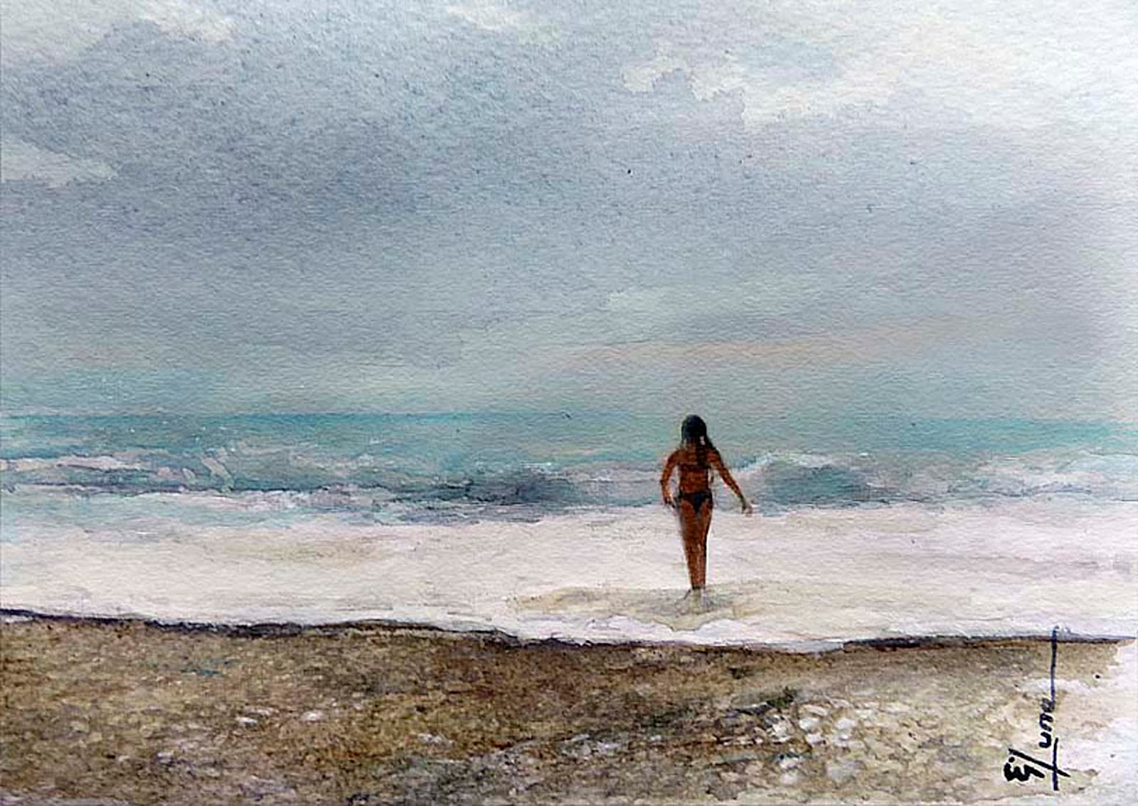
This is the result of this particular exercise
Material needed;
cold press paper 240 gr
masking fluid
watercolors; cerulean blue; burnt umber; Hooker´s Green dark; Payne´s grey; Lemon yellow; turquoise, violet; sap & viridian green
round, fan & angular brush
absorbent paper
pencil for underpainting and sketch
1st Step.- Considering dark colors ahead within some of my objects within the painting I did a detailed rock sketch (which will be in some way my base underpainting) but I didn´t for my background horizon to avoid further staining
2nd Step.- Planing ahead is quite important so wáter splashes with a dark background are the important spots to start masking the wáter splashing drops .- I utilized a plastic tip to conform them
And where there are not dark background I did use a fan brush forming some splashes (In this case I dilute the masking fluid 1:1 for easy handling) .- Do not overdue
On speaking negative painting.- Transparent colors are the best for layering – starting with one wash of color, then adding more washes of color until you build up to the depth of color you want.
In the other hand - opaque This makes them perfect (i.e.) for skin or final colors, which are very light – mostly water and a touch of paint. If you are working wet on wet, opaque colors will tend to spread more slowly than transparent colors and dry with more saturated color. Opaque colors are gorgeous, but they don’t mix well, turning muddy and ugly in some mixtures so for sea spots I will try to avoid into this exercise
(Tip 1.- To find if your painting is transparent or opaque, do a simple test, draw a bold line with a black permanent marker and then stroke the color over that line, transparent colors will dissapear while opaques ones will be visible)
Viridian, and turquoise are not transparent but you can mix it with yellow making them semi-opaque as you can see
Threrefore all my colos at the sea will be transparent or semi-transparent to work with the negative technique .--- The basic idea is to paint color around the lighter objects to define it from close to distant gradually reveling seascape shapes
3rd Step.- I start to indicate and define wave´s shapes
(Tip 2.- I have an absorbent aper in my left hand and my brush in the rigth hand, with same color I can indicate distance perspective lifting it out some color with the absorbent paper at the distance horizon)
4th Step.- Before complete seascape I define darker spots to balance ligth with my colors
5th Step.- You´ll find that is quite easy to apply colos over masking fluid (already completely dry) reveling the splashes as you progress
(Tip 3 You can leave masking fluid within the painting if results as you work are good enough, or take it away if you need to)
6th Step.- We are able to continue adding and building up colors with our transparent selection of colors darker at the bottom of the wave and ligther at the top trough glazing
Glazing is when you paint a transparent layer on top of a dry layer. Opaque paints will look chalky or muddy if used for glazing.
7th Step.- Final touches.- Defining shadowing into the rocks and reafirming White foam with the help of permanent White (gouache) .- this is opaque color but really enhance brigths into the foam top waves and foam lines
(tip 4.- At this time I did use a toothbrush to spattering fine White particles "wáter drops".- to do that the best way is to wet your bristles of the toothbrush and then put the White paint not in the surface but into the bristles interior pushing with your finger, in that way the White particles are quite thinner when you run the finger along the toothbrush bristles, do in the splash direction)
8th Step.- cutting the interest área if you want to
"Welcome to the beach , no clock, no worries"