lunes, 19 de octubre de 2015

Ref 911.- Derwent Graphitone as Underpainting

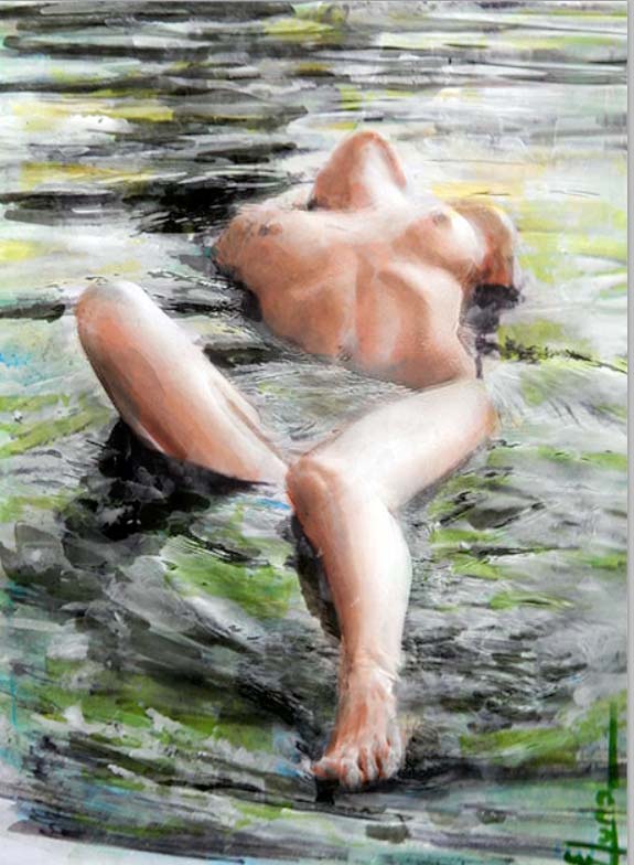
Final result of this process;


For this particular project; I did a combination of methods without be sure about final result, because of the paper I chose "Strathmore serie 500 which is a good paper for pastel paints but can not resist wet in wet activities, as a watercolor paper either hot or cold press, I did because I wanted to take advantage of the colored paper  (light grey for this Project).- Pastel is both a drwg and a painting médium so you don´t need a preliminary underdrawing, therefore I chose Derwent soluble pencils to start and stablish a good foundation
Pencil should never be used for a preliminary drawing, the graphite from which pencils are made is greasy and repels the soft pastel color, but in my Project I´m not using pastel related as should be with this paper I´ll be using modeling paste as shield layer to complete final details

1st step.- This is the questionable part, due the thickness and material  of paper
I prepare White color "gouache" and did a wash trying to represent clouds, applied with sponge which mix pretty good with the grey original paper color, Try do not overdue the wet on wet application
to avoid tear the paper,---then dry it before next steps


2nd step I start to block in, the figure main lines and shadows with graphitone which then be diluted with a fine brush accordingly (this is the underpainting for this particular Project)


3rd step.- This is the "layer shield time application" which I´m doing with molding paste applied with spatula trying to make the smallest thickness posible, Note.- before this step you need to fix it once the 2nd step has been completed
This picture has been taken at the middle of this application, so you can see the modeling paste over it and I put my signature on purpose so you can see how transparent is this molding paste shield  
 
 
4th step.- You can modulate the amount of modeling paste thickness and cover underpainting accordingly, once is dry ( a couple of hours ) I delineate the final lines either with a fine brush or with additional pencil tones or even with markers to complement the different greys required for this figure and again I added White tones to highlight where I wanted to.
 
 
Final notes.- I need to look for a better  paper for this type of Project
I need to modulate better the tones (with practice)
Again I had a good time working with my projects


miércoles, 14 de octubre de 2015

Ref 908 & 909.- Graphite water soluble - experimentation

These references are just experiments; even .- Some notes.- Derwent Graphitints handle exactly like 8B Sketch & Wash pencils, the "dark wash" of the many other brands like Sanford Prismacolor that produces Sketch & Wash pencils in Light Wash, Medium Wash (usually 4B) and Dark Wash (8B). That is, used dry, they are soft and dark and smudgy. You can blend them with your fingers. You can blend them with a bit of toilet paper, facial tissue, cotton bud, nylon imitation cotton bud, tortillon, bit off the end of your frayed jeans, tortillon, stump, Colour Shaper (another UK invention from Royal Sovereign that is indispensible for pastels and oil pastels at least to me, a bit like a rubber tip paint brush in various sizes and hardnesses) or any other blending tool. so I wanted to experiment blending them with watercolor, and I did in the following order:


Experiment with some layers over Canson 98 Lb
Order:
  1. graphite diluted in water and applied by brush
  2. fixer
  3. Color through Watercolor
  4. Derwent pencil 
  5. Fixer
  Notes;  the paper was to thin for this application, but this was the result:
                                     Ref 908


Experiment now with the following order over hot press paper
  1. watercolor 
  2. Derwent pencil (all shadows on it)
  3. Molding paste with color applied with spatula (small thickness possible)
  4. White gouache to highlight
  5. Fixer


I need to make more experimentations to check how to take advantage for blending pencil and watercolor, nevertheless the pencil once fixed gives the details we want, it is important to have a clear and accurate guideline before the molding paste is applied which also works as a shield to avoid muddy conditions, as I did this an experiment didn´t take the care I needed and some of my skin áreas were dirtier and I didn´t make so many details as i could do it.- like I said is an experiment but I have so much fun working on it  

domingo, 11 de octubre de 2015

Ref 907.-Watercolor.-  Exercise, with modeling paste partially applied

This is the final result of this process:


Through all my painting experience, since I started using modelin paste, the paintings are been enhanced a lot due the properties of it , and the way I use to paint (basically from dark to clear), The watercolorist painters most of them start in the opposite way, but my background came from oleo, and acrylic, so with the use of modeling paste,I can start with the painting average color as underpainting and even from dark colors without many specific concerns,
This exercise, is to compare and check how can I take advantage of those properties
My previous painting was made with modeling paste thru all the painting, but in this one it was used just in the watermelon color red to make a kind of deepness and tone´s richness and also in the cardboard box to facilitate folds and wrinkles, and in purpose, I didn´t add the modeling paste to compare how it looks like when I didn´t use at all


Let me tell you that there are many wonderful watercolor paintings of watermelons, but with this technic, you can obtain easy and wonderful results, because once the modeling paste is dry you can add more transparent painting over it as layers, without disturb the underpainting even if you add a lot of wáter, therefore to make the box it was relatively easy 1st the average and dark colors blended with modeling paste 2nd wait to dry. 3rd.- paint with a brush details, and finally another layer of colored or not colored modeling paste applied with spatula to make a minimal thickness layer enough to uniformize results according light source, and the watermelon red color shown a texture ideal for brush color addition which it was completed with watercolor pencil .

In the other hand regarding the watermelon rind I started as I use to with darks and or shadows as underpainting reference, nevertheless once I start to add the greenish color the watercolor below start to dissolve and combine making a muddy appearance if I don´t take care


Well like I said this exercise it was made to check how I can combine technics, and show to you the advantages to work with modeling paste


viernes, 9 de octubre de 2015

Ref 906:- Watercolor; Under-painting and texturing with a spatula

Learning how to get the best posible results when mixing your colors come in time with knowledge and the right amount of practice,
It is easier working with picure references but before mixing watercolors, I take some time to familiarize with their performance on its media in question.

Final result of this process;


Main steps
As thumb rule; I start with primaries lightest watercolor either spot protection and/or application over previous made sketching (for the following example and base on latest painting´s result,
1st step.- I did a graphite solution in wáter (powder charcol mixing with wáter) to make additional underpainting refference texture regarding the forest-Project underway (over hot press paper) and after wait to dry I washed - dry again and fixed  (Note.-this step is not precisely mandatory for this Project)


Step 2.- As you can see in the following picture; the molding paste mixed with watercolor, when applied over the painting sketch didn´t cover the graphite lines underneath, so the dark color will remain as a guide to complete the watercolor painting.- the spatula let us make smoth or coarse surfaces as we need, the color needs to be around the average color of the final painting result in mind or the lightest color


Most of this step is applied with spatula, with different grades of color and the texture can be made as painting dries, you can use a plastic sponge to créate more coarse texture if you need in some particular areas

 
Step 3.- If the painting is not completely dry, with a brush and wáter you can soft some áreas if you need and add more additional colors and/or wait till completely dry to go to the painting itself


Step 4.- This step needs to be after completely dry to block the undepainting colors below (you can fix if you want but is not needed at all) I start by making some color testing which as you can see do not mix with painting below even you add big amount of wáter, so now you can complete the painting
Try not start your puddle with lots of wáter, it Works best to mix your watercolors to achieve the color and value first and try not to overmix your colors
Note for glowing color stay with colors that have not been pre-mixed with their complement You can use two transparent colors and one semi-transparent, the non-staining and transparent properties of the pigments allow each of them to intermingle beautifully on the surface ( see previous ref 905 to check color transparencies list)


Step 5.-  The darker colors added over the underpainting now have more body and clean effect, I like to work with contrast so complementary colors are ideal for that ---I wait to dry before cut and the painting is ready


martes, 6 de octubre de 2015

Ref 905.- Watercolor; Applying or scrapping watercolor paint
                                       with a spatula

This is a new Project "under going"; so now this is my first try out,

First Final result of two from this process:(see 2nd additional result at the bottom)


Following is the material needed;
The requirement for this process is; "molding paste" which is needed for mix and créate a color paste with watercolors basuically, I did use different size of them, an a watercolor pencil to sketching above the hot press paper


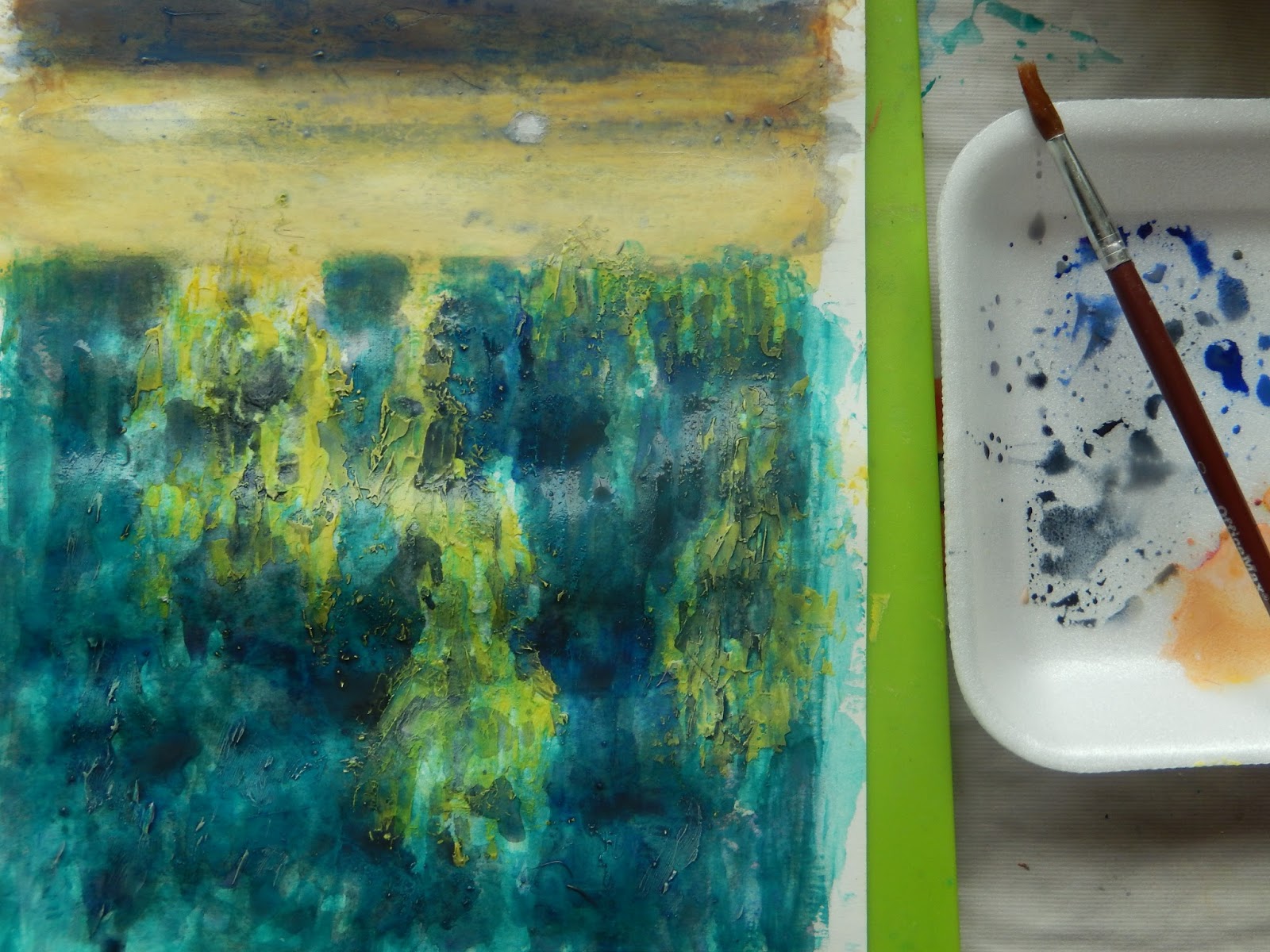
In the following picture you can see how I´m mixing modeling paste and watercolor in some order
to conform the variegated background, kind of graded wash if you will, containing more tan one color, I did start this particular painting from the top


Now with the big size spatula, I´m taking the color paste to apply over the dry paper accordingly.
It is important to mix the colors in advance, lay the colors in bands and wet your fingers a Little bit to mix one into another , to make its appearance more fade and don´t try to work onto the paint while is drying, lay the palest and primary colors first whenever posible, it is not mandatory with this process but I rather work according the base color underpainting either light or dark 
In this case the sky is first tan the sea and the beach color is first also tan the sea depending the effect you want to achieve in the unión main color bands


This process is quite versátil because I can add pure molding paste without any color to make color variations where I need, After you be satisfied, let it dry it doesn´t takes so much time


You can graduate color with your spatula either adding or scrapping color molding paste, and/or add colors in accordance the color Wheel light colors over dark ones but not overdo or the paint will become stirred up and muddy
 
This is the watercolor spatula process complete, after add the dark figure with a Little size spatula, and reinforce the White of lamp  the texture is quite interesting for a watercolor painting


After this first stage completed, and base in past experiences I wanted to enhance the painting  with brush lines in order to soft some áreas, but I left spatula texture in other ones to see what happen, and this is the final additional result 


lunes, 5 de octubre de 2015

Ref 904.- Pastel; Building up a painting

I started with pastel through out my initial painting ref 902, so now I´m learning what I need to do as first thing in this new process (for me), and that is to establish the basic tonal structure, main shapes and colors, this process is know as blocking in; and this is done with hard pastels, they are less crumbly and prone to fall off the paper, provide a solid foundation on which to build u the picture, This is again another painting reproduction, like I said the best way for me to auto learn is to copy the way the artists throw lines in the paintings I like it; the exercises are simple, but provide me with the initial skills I´m looking for.
So summarizing; with hard pastel
1.- Identify the main shapes an colors of your subject
        (use light strokes that do not fill the grain of the paper)
2.- To guide later work identify áreas of dark tone, but do not attempt to
        describe the shapes precisely
3.- Do not take the blocking in process too far ( is the initial foundation)
4.- Start filling in with short Strokes, following the form above the dark initial
       foundation lines and blend it, with your fingers and/or a small semi-hard
       brush (for this particular example)
Notes the drwg as you can see is quite simple, I didn´t change hues yet, just a Little bit of mixing with black and White, in some border´s lines

            "The curved line is the most beautiful line between two points"

domingo, 4 de octubre de 2015

Ref 903/910, Watercolor properties to work over colored paper

Final result of this process:
                                                            Ref 903


In order to be able to make a good painting over colored paper, I have to planing ahead regarding watercolor properties and mixing colors over it; also I need to take advantage of the paper color base
For my following Project I took as a reference a photography in which the raw sienna is the main color element, so thinking on that I´ll have to mix complementary colors which are the colors located across from one another on the color Wheel., learning how to mix them and which colors to choose, can créate color harmony and mood .- the role of the complementary color is to slightly down your original color, and the more of the complementary color you add the more neutralized your initial color becomes.- however I do not want to go completely to the other side in order to keep just one side intensity .---- Yellow´s complement is violet, so to be at the yellow´s side I´ll be playing with yellow ochre, raw sienna and raw umber.
Now let´s go to transparent, semi-opaque and opaque wáter colors- properties
Transparent is just as the Word describes, allow the light to shine through and in turn lets the color of the paper to reflect back
Opaque.- block the light from coming through, making the colors appear to look dull, even though some of the opaque´s are quite vibrant in color

Transparent colors;
Aureolin; New Gambogue; raw sienna ; burnt sienna; Rose Madder; Permanent rose; cobalt blue; viridian; Hooker´s Green; Sap Green

Semi-opaque and opaque colors;
Cadmium yellow; Cadmium orange; Cadmium Scarlet; Cadmium red; Cobalt blue; French ultramarine blue; Cerulean blue; Manganese Blue

Colors that contain White and black
Yellow ochre; Raw Umber;Burnt umber;Sepia; Mars violet; Payne´s grey, Black

Among many others;

Colors need to be planned ahead to avoid most of the watercolor problems, as this is one of my first paintings over colored paper I did test with same paper and semiopaque colors to really cover what I need and I use paper towels to lift the color allowing to show and combine with the paper color undernith.-


1st Step, I´m working with Ingrid colored paper in which my first lines are made with watercolor pencil, to set the main sketch


2nd main Step After selectionate semi-opaque colors to use (transparent dídn´t work at all in colored paper) regarding complementary colors I start with darker values, in the case of the flowers my watercolor main color it was lifted it out with paper towels in order to show the blending of color with the colored paper below, and same for background, to reinforce some final colors as I was working they were blending with opaque colors basically médium yellow, red sepia, and White
 
 
3rd Main step:- The paper .- The weight of the watercolor paper is not indicative of quality because the best paper comes in both heavy and light varieties, but is an important point in this case, because it can not absorb more wáter and make a lot of buckles so you need to work Little by Little and let it dry to continue, taping the paper to the board also didn´t work at all
 
The final touchs are the semi-opaque colors mixed with opaque White without lifting color out.-
 
 
Ref 910
Another example but now with blue paper, same quality
The difference is the White color in the following painting I did use White of watercolor instead of White of gouache, after completed the White is very rich, however after dry completely the White is lost and there is no contrast .- thats way I recommend gouche White
 
The picture below, is just after white color application so everything looks pretty good